Chart position — tracked daily by LaunchShots
Screenshot style breakdown
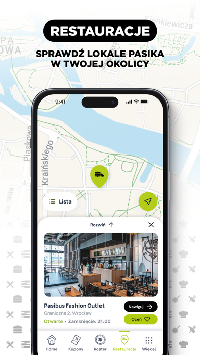
Sampled from 5 of PASIBUS's App Store screenshots — background, accent and theme, measured by LaunchShots (not something Apple publishes).
#ACCC0C bg
#97B30A
#D4E484 accent
#111111 text
Screenshots


Icon palette
About this app
Czołem, PasiBrzuchu! Szukasz całkiem nowych kuponów, bonusów i nieskończonych możliwości? Bardzo dobrze trafiłeś. Z tą apką złapiesz okazje, które nie będą dostępne nigdzie indziej! Ale to nie wszystko, czytaj dalej. Twoja apka zmieni się w koster Zamów Pasi Ucztę na kiosku, zeskanuj dedykowany kod QR, a apka da Ci znać, kiedy jedzonko będzie gotowe! Dzięki temu nie musisz czekać na swój numerek, możesz wygodnie rozsiąść się i czekać na powiadomienie o zamówieniu. Bonusowe kupony i specjalne nagrody tylko a APLIKACJI! Przeglądaj kupony wygodnie w aplikacji. Tylko tutaj znajdziesz bonusowe zniżki, których nie ma nigdzie indziej! Kupony czasowe, turbo promki i mega zniżki? Tylko z Pasi Apką! Realizuj specjalne promo kody Miej oczy szeroko otwarte. Promo kody mogą być wszędzie! Co się z nimi kryje? Przekozackie promki! Szukaj promo kodów na mieście i w sieci, zgarniaj nagrody w Pasi…
App details
What you can learn from PASIBUS
Every shipping app on the App Store has gone through the same decisions you're working through right now: which screenshot goes first, what caption sits over it, which device frame to show, what color the background should be. The 5 screenshots above are PASIBUS's answers to those questions — they're public, they're real, and they made it through Apple's review.
What the numbers say: PASIBUS runs a light set where the background shifts from screenshot to screenshot (first shot #ACCC0C) — each image has to stand on its own, so the captions carry more of the story. The accent colour we picked up, #D4E484, is the one to reuse for badges, arrows and highlighted words if you borrow this look. Hit Use this style to open the editor with these exact colours and drop your own screenshot in.
Notice the first screenshot in particular. It's the one users see in search results and on the product page, and it's where most apps spend their best caption and tightest design. Look at the proportion of background to phone, where the text sits, what one thing the image is trying to communicate.
Want to see how other Food & Drink apps approach the same problem? Browse more Food & Drink apps in the showcase.
Take what works into your own screenshots
Open LaunchShots and design your App Store & Google Play screenshots — pick a device frame, drop captions, ship in minutes. Free, in your browser.
Open the screenshot editor →Apps with a similar look
Closest background + accent colours among the listings we've analysed — useful when you want to see the same palette handled by a different team.