Chart position — tracked daily by LaunchShots
Screenshot style breakdown
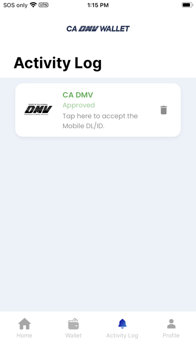
Sampled from 6 of CA DMV Wallet's App Store screenshots — background, accent and theme, measured by LaunchShots (not something Apple publishes).
#141CAC bg
#343BB7
#2474CC accent
#FFFFFF text
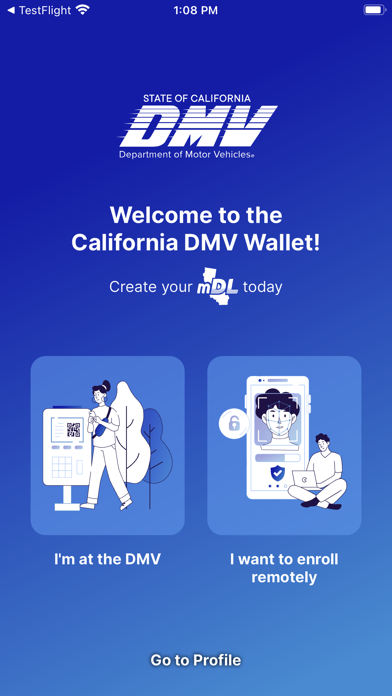
- #1I'm at the DMV I want to enroll remotely Go to Profile
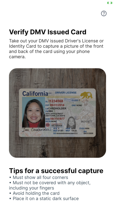
- #2Tips for a successful capture * Must show all four corners + Must not be covered with any
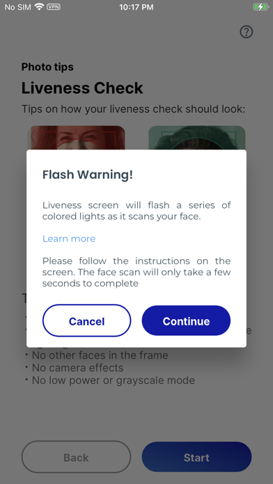
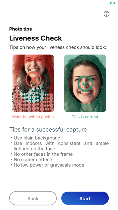
- #4lighting on the face + No other faces in the frame + No camera effects
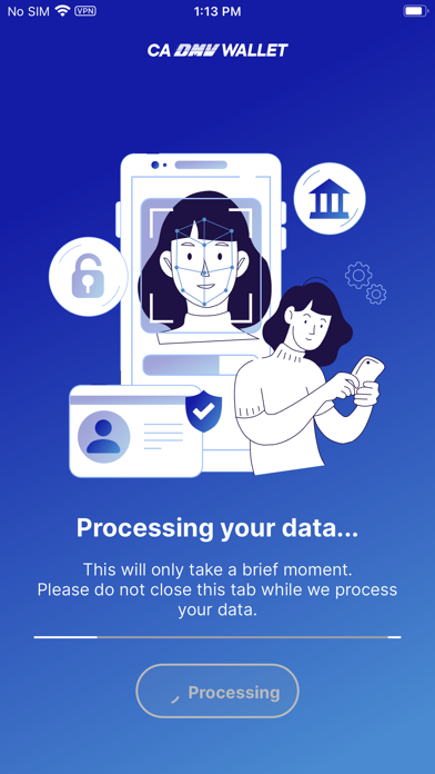
- #5This will only take a brief moment. Please do not close this tab while we process your dat
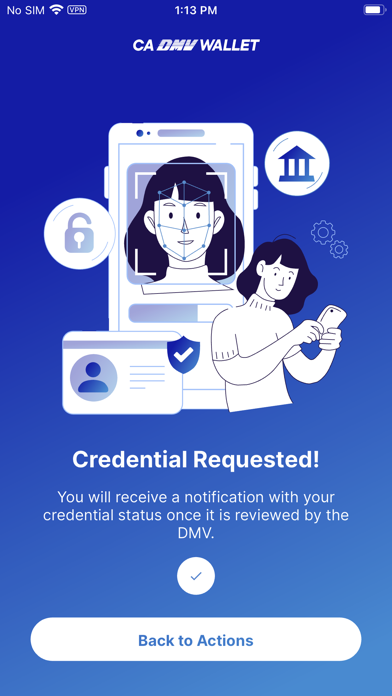
- #6You will receive a notification with your credential status once it is reviewed by the DMV
Captions read from the screenshots (OCR, may contain small errors): 5 headlines, 15.8 words on average (longest 18), 40% speak to "you".
Screenshots
Icon palette
About this app
Now live in Pilot Phase – California DMV Mobile Wallet Californians now have a secure way to present their driver’s license or identification card using their smartphones via a Mobile Driver’s License (mDL) digital credential. California DMV Wallet gives you the control of the driver’s license data you share with others. For example, when buying age-restricted items, the app can confirm you are of legal age without having to share your birth date or address. With mDL in your CA DMV Wallet, you can breeze through the TSA queue at the airports using your phone. You can also enroll in the TruAge program via the Wallet Marketplace to purchase age-verified products at a corner store near you (starting with select pilot locations in California and expanding nationally). The Wallet will soon be supporting online identity verification for government and commercial applications. Designed wi…
App details
What you can learn from CA DMV Wallet
Every shipping app on the App Store has gone through the same decisions you're working through right now: which screenshot goes first, what caption sits over it, which device frame to show, what color the background should be. The 9 screenshots above are CA DMV Wallet's answers to those questions — they're public, they're real, and they made it through Apple's review.
What the numbers say: CA DMV Wallet runs a mixed light-and-dark set where the background shifts from screenshot to screenshot (first shot #141CAC) — each image has to stand on its own, so the captions carry more of the story. The accent colour we picked up, #2474CC, is the one to reuse for badges, arrows and highlighted words if you borrow this look. Hit Use this style to open the editor with these exact colours and drop your own screenshot in.
Notice the first screenshot in particular. It's the one users see in search results and on the product page, and it's where most apps spend their best caption and tightest design. Look at the proportion of background to phone, where the text sits, what one thing the image is trying to communicate.
Want to see how other Travel apps approach the same problem? Browse more Travel apps in the showcase.
Take what works into your own screenshots
Open LaunchShots and design your App Store & Google Play screenshots — pick a device frame, drop captions, ship in minutes. Free, in your browser.
Open the screenshot editor →Apps with a similar look
Closest background + accent colours among the listings we've analysed — useful when you want to see the same palette handled by a different team.