Chart position — tracked daily by LaunchShots
Screenshot style breakdown
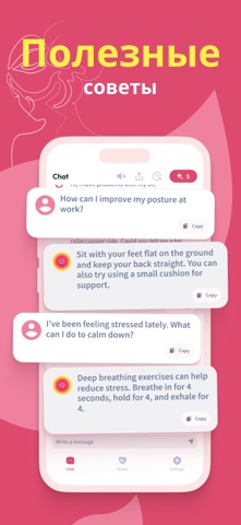
Sampled from 6 of Вибратор: Вибрация Сильная!'s App Store screenshots — background, accent and theme, measured by LaunchShots (not something Apple publishes).
#DC4C6C bg
#E06580
#FCEC5C accent
#FFFFFF text
Screenshots




Icon palette
About this app
Откройте для себя Вибратор - превосходное мобильное приложение, призванное повысить уровень вашей релаксации. Простая установка, индивидуальные шаблоны и прикосновение к энергии - и вы погрузитесь в мир спокойствия. Ознакомьтесь с обширным набором разнообразных вибраций, которые идеально соответствуют вашим предпочтениям. Улучшите свое самочувствие, точно выполняя массаж шеи и тела. ИИ-массажист - получите мгновенную профессиональную помощь в области массажа. Общайтесь с массажистом AI в любое время 24/7. ИИ-массажист индивидуально подберет для вас технику массажа, силу вибрации и время. А также даст ответ на любой вопрос в области массажа и работы с телом. Откройте для себя множество исключительных возможностей вместе с Вибратор: - ИИ-массажист, доступный 24 часа в сутки 7 дней в неделю. - Окунитесь в десятки эксклюзивных и бодрящих моделей вибрации. - Простая навигация по удобном…
App details
What you can learn from Вибратор: Вибрация Сильная!
Every shipping app on the App Store has gone through the same decisions you're working through right now: which screenshot goes first, what caption sits over it, which device frame to show, what color the background should be. The 6 screenshots above are Вибратор: Вибрация Сильная!'s answers to those questions — they're public, they're real, and they made it through Apple's review.
What the numbers say: Вибратор: Вибрация Сильная! runs a dark set with one background colour (#DC4C6C) carried across every screenshot — the listing reads as a single poster when the shots sit side by side in search results. The accent colour we picked up, #FCEC5C, is the one to reuse for badges, arrows and highlighted words if you borrow this look. Hit Use this style to open the editor with these exact colours and drop your own screenshot in.
Notice the first screenshot in particular. It's the one users see in search results and on the product page, and it's where most apps spend their best caption and tightest design. Look at the proportion of background to phone, where the text sits, what one thing the image is trying to communicate.
Want to see how other Health & Fitness apps approach the same problem? Browse more Health & Fitness apps in the showcase.
Take what works into your own screenshots
Open LaunchShots and design your App Store & Google Play screenshots — pick a device frame, drop captions, ship in minutes. Free, in your browser.
Open the screenshot editor →Apps with a similar look
Closest background + accent colours among the listings we've analysed — useful when you want to see the same palette handled by a different team.