Chart position — tracked daily by LaunchShots
Screenshot style breakdown
Sampled from 4 of Bankje's App Store screenshots — background, accent and theme, measured by LaunchShots (not something Apple publishes).
#044424 bg
#275E42
#54846C accent
#FFFFFF text
Screenshots


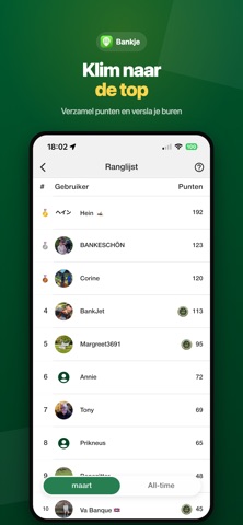
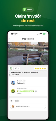
iPad screenshots


Icon palette
About this app
Welkom bij Bankje, dé app die bankjes transformeert tot meer dan alleen zitplekken. Verken jouw omgeving op een unieke manier, ontdek charmante bankjes die op je wachten, en deel jouw ervaringen met een bloeiende gemeenschap van bankjeliefhebbers. Ontdek Bankjes op een Interactieve Kaart: Verken jouw stad, parken en paden met onze interactieve kaart vol met bankjes. Of je nu zoekt naar een rustig plekje om te lezen, een serene plek om de zonsondergang te bewonderen, of gewoon even wilt ontspannen, Bankje wijst je de weg naar de meest betoverende plekken. Deel Jouw Favoriete Bankjes: Voeg jouw favoriete bankjes toe aan onze groeiende kaart en laat anderen delen in jouw ontdekkingen. Leg hun unieke karakter vast met foto's en laat mede-ontdekkers zien waarom juist deze plekjes zo bijzonder zijn. Beoordeel Bankjes en Spaar Zitcoins: Laat je waardering zien voor de bankjes die je hebt be…
App details
What you can learn from Bankje
Every shipping app on the App Store has gone through the same decisions you're working through right now: which screenshot goes first, what caption sits over it, which device frame to show, what color the background should be. The 6 screenshots above are Bankje's answers to those questions — they're public, they're real, and they made it through Apple's review.
What the numbers say: Bankje runs a mixed light-and-dark set where the background shifts from screenshot to screenshot (first shot #044424) — each image has to stand on its own, so the captions carry more of the story. The accent colour we picked up, #54846C, is the one to reuse for badges, arrows and highlighted words if you borrow this look. Hit Use this style to open the editor with these exact colours and drop your own screenshot in.
Notice the first screenshot in particular. It's the one users see in search results and on the product page, and it's where most apps spend their best caption and tightest design. Look at the proportion of background to phone, where the text sits, what one thing the image is trying to communicate.
Want to see how other Lifestyle apps approach the same problem? Browse more Lifestyle apps in the showcase.
Take what works into your own screenshots
Open LaunchShots and design your App Store & Google Play screenshots — pick a device frame, drop captions, ship in minutes. Free, in your browser.
Open the screenshot editor →Apps with a similar look
Closest background + accent colours among the listings we've analysed — useful when you want to see the same palette handled by a different team.