Chart position — tracked daily by LaunchShots
Screenshot style breakdown
Sampled from 3 of modi: интернет магазин онлайн's App Store screenshots — background, accent and theme, measured by LaunchShots (not something Apple publishes).
#FCFCFC bg
#DDDDDD
#A40404 accent
#111111 text
Reading the caption text from the screenshots in your browser…
Screenshots


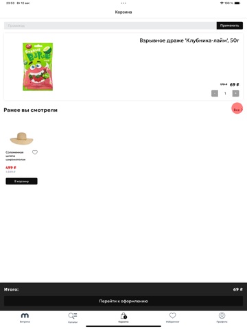
iPad screenshots

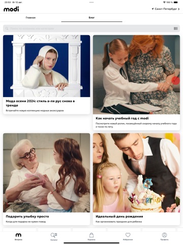
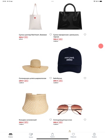

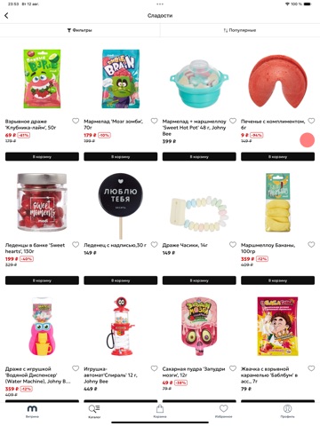
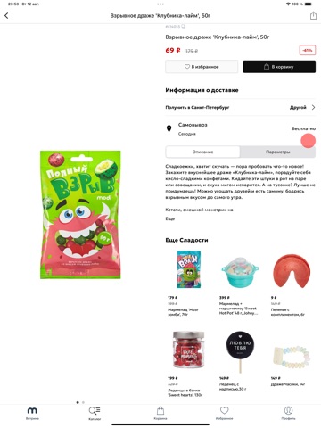

Icon palette
About this app
modi — интернет магазин где собрано всё, что делает жизнь ярче, удобнее и веселее. Хотите подарки, от которых визжат от восторга? Настольные игры для поднятия настроения? Или украшения, чтобы собрать все взгляды на себе? modi — это онлайн шопинг, где не вы ищете вещи, а они находят вас. Проверь — что выберет ваше сердце сегодня? ОНЛАЙН ШОПИНГ СТАЛ ЕЩЕ ПРИЯТНЕЕ С modi Устанавливайте интернет магазин modi и убедитесь, что шопинг может быть удобным и простым. Ловите плюшки в modi — получите подарок от нас, скидку 5% на первый заказ — просто зайдите в свой аккаунт! Тысячи товаров — от мемных до люксовых, сохраняйте понравившееся, чтобы не потерять. УДОБСТВО НА МАКСИМУМ С modi Легкий поиск — найдите что угодно за пару кликов.. Личные рекомендации — мы знаем, что вам понравится. Акции и скидки – экономьте, как настоящий шопоголик. Выбирайте, оплачивайте, бронируйте — всё в одном месте. Заб…
App details
What you can learn from modi: интернет магазин онлайн
Every shipping app on the App Store has gone through the same decisions you're working through right now: which screenshot goes first, what caption sits over it, which device frame to show, what color the background should be. The 11 screenshots above are modi: интернет магазин онлайн's answers to those questions — they're public, they're real, and they made it through Apple's review.
What the numbers say: modi: интернет магазин онлайн runs a light set with one background colour (#FCFCFC) carried across every screenshot — the listing reads as a single poster when the shots sit side by side in search results. The accent colour we picked up, #A40404, is the one to reuse for badges, arrows and highlighted words if you borrow this look. Hit Use this style to open the editor with these exact colours and drop your own screenshot in.
Notice the first screenshot in particular. It's the one users see in search results and on the product page, and it's where most apps spend their best caption and tightest design. Look at the proportion of background to phone, where the text sits, what one thing the image is trying to communicate.
Want to see how other Shopping apps approach the same problem? Browse more Shopping apps in the showcase.
Take what works into your own screenshots
Open LaunchShots and design your App Store & Google Play screenshots — pick a device frame, drop captions, ship in minutes. Free, in your browser.
Open the screenshot editor →Apps with a similar look
Closest background + accent colours among the listings we've analysed — useful when you want to see the same palette handled by a different team.