Screenshot changes — detected by LaunchShots
Screenshot style breakdown
Sampled from 6 of Cleaner App : Free up Storage's App Store screenshots — background, accent and theme, measured by LaunchShots (not something Apple publishes).
#34C4FC bg
#2DACDD
#446CEC accent
#111111 text
Reading the caption text from the screenshots in your browser…
Screenshots


iPad screenshots


Icon palette
About this app
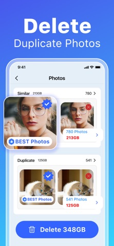
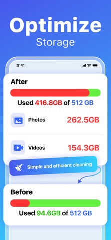
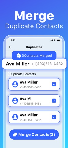
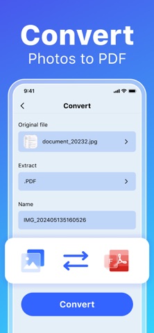
Our app provides a comprehensive set of tools to declutter your device and keep it organized. Here are some of the key features: - Remove Duplicate & Similar Photos: Find and remove duplicate or nearly identical photos and screenshots, keeping your gallery tidy. - Clean Duplicate Videos & Screen Recordings: Detect and remove duplicate videos and screen recordings. - Merge Duplicate Contacts: Automatically identify and merge duplicate or incomplete contacts for a cleaner address book. - Video Compression Easily reduce the size of your videos without compromising quality. Perfect for managing large video files with just a few taps. - Private Photo Vault Keep your private photos protected in an encrypted album accessible only with your passcode, providing enhanced privacy and security. - Convert Photos to PDF: Convert multiple photos into one PDF file, so you can delete the merged ph…
App details
What you can learn from Cleaner App : Free up Storage
Every shipping app on the App Store has gone through the same decisions you're working through right now: which screenshot goes first, what caption sits over it, which device frame to show, what color the background should be. The 11 screenshots above are Cleaner App : Free up Storage's answers to those questions — they're public, they're real, and they made it through Apple's review.
What the numbers say: Cleaner App : Free up Storage runs a mixed light-and-dark set where the background shifts from screenshot to screenshot (first shot #34C4FC) — each image has to stand on its own, so the captions carry more of the story. The accent colour we picked up, #446CEC, is the one to reuse for badges, arrows and highlighted words if you borrow this look. Hit Use this style to open the editor with these exact colours and drop your own screenshot in.
Notice the first screenshot in particular. It's the one users see in search results and on the product page, and it's where most apps spend their best caption and tightest design. Look at the proportion of background to phone, where the text sits, what one thing the image is trying to communicate.
Want to see how other Utilities apps approach the same problem? Browse more Utilities apps in the showcase.
Take what works into your own screenshots
Open LaunchShots and design your App Store & Google Play screenshots — pick a device frame, drop captions, ship in minutes. Free, in your browser.
Open the screenshot editor →Apps with a similar look
Closest background + accent colours among the listings we've analysed — useful when you want to see the same palette handled by a different team.