Chart position — tracked daily by LaunchShots
Screenshot style breakdown
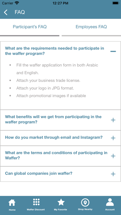
Sampled from 5 of Waffer Card's App Store screenshots — background, accent and theme, measured by LaunchShots (not something Apple publishes).
#FCFCFC bg
#DDDDDD
#4C84A4 accent
#111111 text
Screenshots



Icon palette
About this app
من منطلق حرصنا على تقديم الأفضل والمميز وتطبيق الجودة الشاملة إرتقاءً بمستوى الخدمات المقدمة للموظفين، ومن خلال الحرص على دعم الإقتصاد المحلي في إمارة الشارقة وفي دولة الإمارات العربية المتحدة بما يعود بالنفع على دفع عجلة الإقتصاد الوطني ونمائه بشكل مستمر، وعلى كافة دوائر وهيئات حكومة الشارقة. تم إطلاق "بطاقة وفر" مبادرة حكومية من دائرة الموارد البشرية بحكومة الشارقة في شهر مارس من عام 2013، وهي أول مبادرة خصومات على مستوى الدولة تشمل موظفي حكومة الشارقة، المتقاعدين والفئات الأخرى من المستفيدين. ويأتي هذا المشروع في إطار سلسة متكاملة من الأنشطة المجتمعية التي تتبناها الدائرة من خلال استراتيجيتها مواكبة لرؤية حكومة الشارقة وعلى رأسها تعزيز انتماء موظفي حكومة الشارقة لمؤسسات وجهات العمل المسؤولة عليهم على حد سواء ويتم ذلك من خلال تقديم مميزات وحوافز تساعدهم على مجابهة التحديات المعيشية. فضلا عن دعم أسس الشراكة مع مؤسسات القطاع الخاص بتمكينها بتقديم العديد من الخصومات والامتيازات لحاملي بط…
App details
What you can learn from Waffer Card
Every shipping app on the App Store has gone through the same decisions you're working through right now: which screenshot goes first, what caption sits over it, which device frame to show, what color the background should be. The 5 screenshots above are Waffer Card's answers to those questions — they're public, they're real, and they made it through Apple's review.
What the numbers say: Waffer Card runs a mixed light-and-dark set where the background shifts from screenshot to screenshot (first shot #FCFCFC) — each image has to stand on its own, so the captions carry more of the story. The accent colour we picked up, #4C84A4, is the one to reuse for badges, arrows and highlighted words if you borrow this look. Hit Use this style to open the editor with these exact colours and drop your own screenshot in.
Notice the first screenshot in particular. It's the one users see in search results and on the product page, and it's where most apps spend their best caption and tightest design. Look at the proportion of background to phone, where the text sits, what one thing the image is trying to communicate.
Want to see how other Lifestyle apps approach the same problem? Browse more Lifestyle apps in the showcase.
Take what works into your own screenshots
Open LaunchShots and design your App Store & Google Play screenshots — pick a device frame, drop captions, ship in minutes. Free, in your browser.
Open the screenshot editor →Apps with a similar look
Closest background + accent colours among the listings we've analysed — useful when you want to see the same palette handled by a different team.