Chart position — tracked daily by LaunchShots
Screenshot changes — detected by LaunchShots
Screenshot style breakdown
Sampled from 6 of Скачки роста, сон и кормление's App Store screenshots — background, accent and theme, measured by LaunchShots (not something Apple publishes).
#94AC74 bg
#829766
#5C6C3C accent
#111111 text
Screenshots





Icon palette
About this app
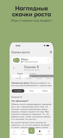
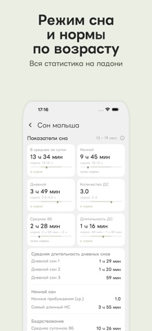
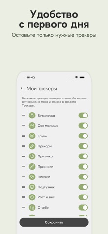
Первые месяцы с малышом — это счастье и сотни вопросов каждый день: выспался ли, наелся ли, сколько уже бодрствует, почему капризничает сегодня? mamsapp мягко берёт рутину на себя — запоминает кормления, сны, подгузники и скачки роста, чтобы вы держали в голове меньше, а рядом с малышом были больше. Дневник и трекер малыша — всё важное под рукой. Сон, который наконец понятен Отмечайте сны одним касанием — а приложение соберёт ясную картину: средний суточный сон, комфортное время бодрствования по возрасту, длительность дневных снов (ДС1, ДС2, ДС3) и ночные пробуждения. Вы увидите, вписывается ли режим дня ребёнка в нормы сна для его возраста, — без тревожного гугления по ночам. Кормление без таблиц в блокноте Таймер кормления грудью с переключением «левая/правая», учёт смеси из бутылочки, первый прикорм и новые продукты. Всё грудное вскармливание и весь режим дня — в одном месте. Ска…
App details
What you can learn from Скачки роста, сон и кормление
Every shipping app on the App Store has gone through the same decisions you're working through right now: which screenshot goes first, what caption sits over it, which device frame to show, what color the background should be. The 9 screenshots above are Скачки роста, сон и кормление's answers to those questions — they're public, they're real, and they made it through Apple's review.
What the numbers say: Скачки роста, сон и кормление runs a light set where the background shifts from screenshot to screenshot (first shot #94AC74) — each image has to stand on its own, so the captions carry more of the story. The accent colour we picked up, #5C6C3C, is the one to reuse for badges, arrows and highlighted words if you borrow this look. Hit Use this style to open the editor with these exact colours and drop your own screenshot in.
Notice the first screenshot in particular. It's the one users see in search results and on the product page, and it's where most apps spend their best caption and tightest design. Look at the proportion of background to phone, where the text sits, what one thing the image is trying to communicate.
Want to see how other Health & Fitness apps approach the same problem? Browse more Health & Fitness apps in the showcase.
Take what works into your own screenshots
Open LaunchShots and design your App Store & Google Play screenshots — pick a device frame, drop captions, ship in minutes. Free, in your browser.
Open the screenshot editor →Apps with a similar look
Closest background + accent colours among the listings we've analysed — useful when you want to see the same palette handled by a different team.