Chart position — tracked daily by LaunchShots
Screenshot changes — detected by LaunchShots
Screenshot style breakdown
Sampled from 6 of 向僵尸开炮-尸潮来袭's App Store screenshots — background, accent and theme, measured by LaunchShots (not something Apple publishes).
#6C241C bg
#80423B
#FCB464 accent
#FFFFFF text
Screenshots
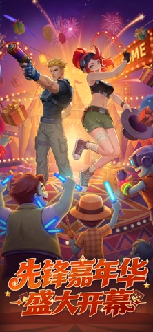


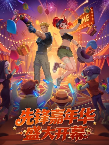
iPad screenshots


Icon palette
About this app
《向僵尸开炮》是一款制作精良、画风精美的射击Roguelike手游。故事背景设定在未来时代,某日天灾席卷地球,僵尸横行,自然资源与科技文明受到重创;为了保护人类与重建地球家园,玩家将扮演一名先锋官,与僵尸展开激烈的战斗。 游戏内有丰富的地图和怪物种类,以及完全随机的技能搭配;战斗之余还可以前往基地酒馆邂逅各类雇佣兵、打造战斗核心,在玩法上兼具养成趣味与Roguelike的爽感,血脉偾张爽感拉满 爽快割草感「一炮倒一片」 高自由度枪械养成 科技与火药是左膀右臂 局内技能完全随机,实力与运气带来胜利 精美画面+诙谐风格,休闲解压 作为先锋官的你将镇守防线,肆意横扫来袭尸潮!
App details
What you can learn from 向僵尸开炮-尸潮来袭
Every shipping app on the App Store has gone through the same decisions you're working through right now: which screenshot goes first, what caption sits over it, which device frame to show, what color the background should be. The 12 screenshots above are 向僵尸开炮-尸潮来袭's answers to those questions — they're public, they're real, and they made it through Apple's review.
What the numbers say: 向僵尸开炮-尸潮来袭 runs a dark set with one background colour (#6C241C) carried across every screenshot — the listing reads as a single poster when the shots sit side by side in search results. The accent colour we picked up, #FCB464, is the one to reuse for badges, arrows and highlighted words if you borrow this look. Hit Use this style to open the editor with these exact colours and drop your own screenshot in.
Notice the first screenshot in particular. It's the one users see in search results and on the product page, and it's where most apps spend their best caption and tightest design. Look at the proportion of background to phone, where the text sits, what one thing the image is trying to communicate.
Want to see how other Games apps approach the same problem? Browse more Games apps in the showcase.
Take what works into your own screenshots
Open LaunchShots and design your App Store & Google Play screenshots — pick a device frame, drop captions, ship in minutes. Free, in your browser.
Open the screenshot editor →Apps with a similar look
Closest background + accent colours among the listings we've analysed — useful when you want to see the same palette handled by a different team.