Chart position — tracked daily by LaunchShots
Screenshot style breakdown
Sampled from 6 of Daf Mishnayos- משניות דף היומי's App Store screenshots — background, accent and theme, measured by LaunchShots (not something Apple publishes).
#24642C bg
#427949
#F4D444 accent
#FFFFFF text
Reading the caption text from the screenshots in your browser…
Screenshots
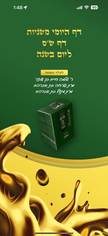
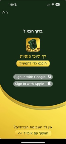
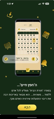
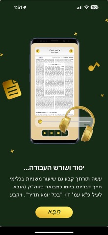

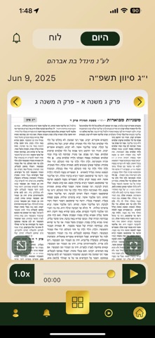
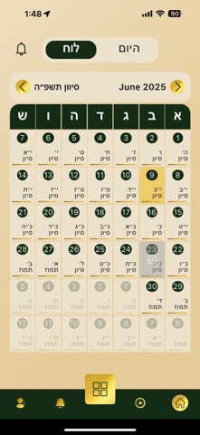

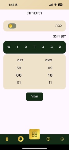
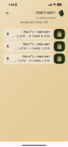
Icon palette
About this app
כל יהודי מכיר בזכות האדירה שבלימוד הש"ס מדי יום. כבר קרוב למאה שנה שיהודים מכל העולם לומדים את הדף היומי שתיקן מרן הגאון ר' מאיר שפירא מלובלין זצ"ל. אנו מאמינים שלכל יהודי – מכל מקום, בכל גיל ורמת לימוד – מגיעה הזכות להתחבר ללימוד התורה באופן יומיומי, גם לאלה שחיים בלחץ ובקושי מוצאים זמן. לכן הקמנו בשנת תש"פ מתנה עולמית: פרויקט המאפשר לאלפי יהודים ללמוד בכל יום מספר משניות עם ביאור נגיש, בעברית ברורה ובשפה שווה לכל נפש – וכל זה בכמה דקות בלבד ביום. תוך פחות משנה הצטרפו מעל 15,000 לומדים מיותר מ-40 מדינות. אז למה לחכות? הורד את האפליקציה עוד היום, והצטרף למהפכה. האפליקציה פשוטה ונוחה לשימוש, תאפשר לך לסמן פרקים שלמדת, לקבוע תזכורות, להמשיך מהמקום האחרון, לשמור סימניות, להתעדכן על סיומים ברחבי העולם – ועוד המון. האפליקציה פותחה על ידי Ace Web Optimization Inc. לעילוי נשמת פריחה בת אברהם, מינדל בת אברהם, ושלמה חיים בן עוזר.
App details
What you can learn from Daf Mishnayos- משניות דף היומי
Every shipping app on the App Store has gone through the same decisions you're working through right now: which screenshot goes first, what caption sits over it, which device frame to show, what color the background should be. The 10 screenshots above are Daf Mishnayos- משניות דף היומי's answers to those questions — they're public, they're real, and they made it through Apple's review.
What the numbers say: Daf Mishnayos- משניות דף היומי runs a mixed light-and-dark set where the background shifts from screenshot to screenshot (first shot #24642C) — each image has to stand on its own, so the captions carry more of the story. The accent colour we picked up, #F4D444, is the one to reuse for badges, arrows and highlighted words if you borrow this look. Hit Use this style to open the editor with these exact colours and drop your own screenshot in.
Notice the first screenshot in particular. It's the one users see in search results and on the product page, and it's where most apps spend their best caption and tightest design. Look at the proportion of background to phone, where the text sits, what one thing the image is trying to communicate.
Want to see how other Book apps approach the same problem? Browse more Book apps in the showcase.
Take what works into your own screenshots
Open LaunchShots and design your App Store & Google Play screenshots — pick a device frame, drop captions, ship in minutes. Free, in your browser.
Open the screenshot editor →Apps with a similar look
Closest background + accent colours among the listings we've analysed — useful when you want to see the same palette handled by a different team.