Screenshot style breakdown
Sampled from 6 of TDS - Tower Destiny Survive's App Store screenshots — background, accent and theme, measured by LaunchShots (not something Apple publishes).
#AC7444 bg
#B7875E
#E4DC94 accent
#FFFFFF text
Screenshots
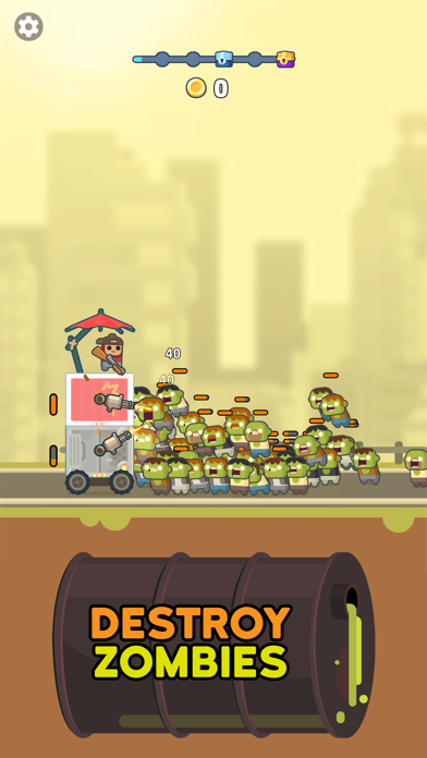
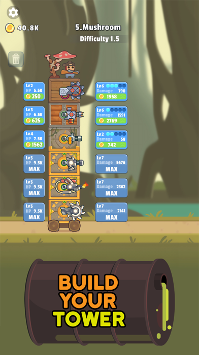
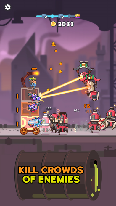
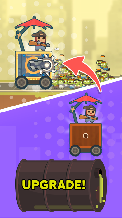
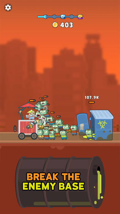
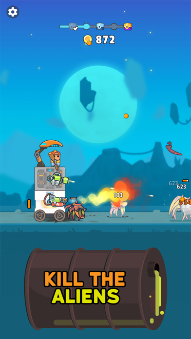
iPad screenshots


Icon palette
About this app
► EL REY DEL CASTILLO Técnicamente es una torre, pero eso es lo de menos. Es tuya, siempre y cuando logres mantener a los zombis alejados de ella en este juego estratégico de defensa de torres. Por la cantidad de zombis que vagan por las calles, parece que el apocalipsis nuclear se cierne sobre nosotros, así que ten tu arma a mano mientras construyes tu torre y la mantienes en movimiento a pesar de las oleadas de zombis. ► CONSTRUYE Y DEFIENDE Para construir tu torre, tendrás que conseguir diferentes bloques a medida que avances, que luego podrás montar para levantar tu fortaleza y luchar por tu supervivencia. Dentro de cada uno de los niveles puedes añadir diferentes armas que te ayudarán a mantenerte a salvo y en movimiento a pesar de las masas de zombis que intentarán entrar para comerte el cerebro. ¡Ten cuidado! Una vez que tus defensas caigan, la muerte estará a un paso, ¡así qu…
App details
What you can learn from TDS - Tower Destiny Survive
Every shipping app on the App Store has gone through the same decisions you're working through right now: which screenshot goes first, what caption sits over it, which device frame to show, what color the background should be. The 12 screenshots above are TDS - Tower Destiny Survive's answers to those questions — they're public, they're real, and they made it through Apple's review.
What the numbers say: TDS - Tower Destiny Survive runs a dark set where the background shifts from screenshot to screenshot (first shot #AC7444) — each image has to stand on its own, so the captions carry more of the story. The accent colour we picked up, #E4DC94, is the one to reuse for badges, arrows and highlighted words if you borrow this look. Hit Use this style to open the editor with these exact colours and drop your own screenshot in.
Notice the first screenshot in particular. It's the one users see in search results and on the product page, and it's where most apps spend their best caption and tightest design. Look at the proportion of background to phone, where the text sits, what one thing the image is trying to communicate.
Want to see how other Games apps approach the same problem? Browse more Games apps in the showcase.
Take what works into your own screenshots
Open LaunchShots and design your App Store & Google Play screenshots — pick a device frame, drop captions, ship in minutes. Free, in your browser.
Open the screenshot editor →Apps with a similar look
Closest background + accent colours among the listings we've analysed — useful when you want to see the same palette handled by a different team.