Chart position — tracked daily by LaunchShots
Screenshot style breakdown
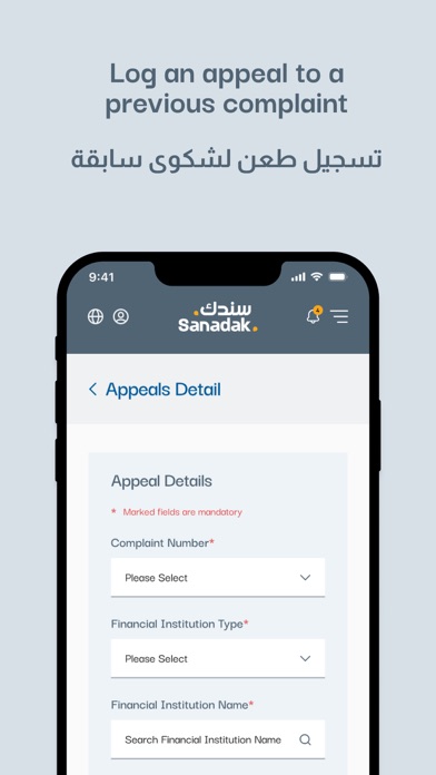
Sampled from 5 of Sanadak - UAE's App Store screenshots — background, accent and theme, measured by LaunchShots (not something Apple publishes).
#D4E4E4 bg
#BAC8C8
#445C74 accent
#111111 text
Screenshots
Icon palette
About this app
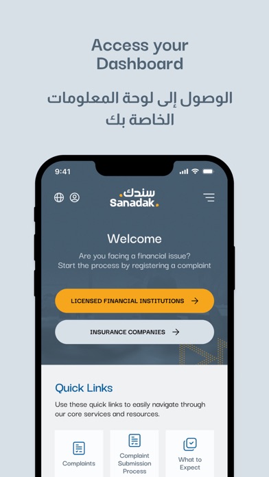
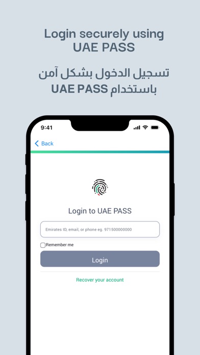
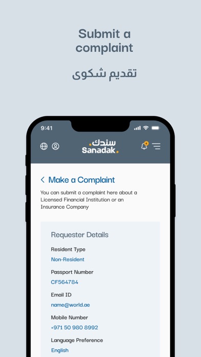
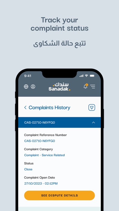
مرحبا بك في تطبيق سندك، منصة الأمان المالي والتأمين الرائدة في منطقة الشرق الأوسط وشمال أفريقيا، والتي تضع معايير جديدة لحل شكاوى المستهلكين في القطاع المالي لدولة الإمارات العربية المتحدة. لماذا سندك؟ تم تصميم سندك لتحويل طريقة التعامل مع الشكاوى في مجالي المال والتأمين في الإمارات. بالتزامنا نحو التميز، وعمليات الحل الواضحة والفعالة، والشفافية، نهدف إلى استعادة وحماية الثقة في الخدمات المالية بالإمارات. ما نقدمه: - تغطية واسعة: يغطي تطبيق سندك مجموعة شاملة من المنتجات والخدمات المالية والتأمينية. سواء كان النزاع حول حسابات بنكية، بطاقات ائتمان، قروض شخصية، أنواع مختلفة من التأمين (الصحي، السيارة، العقار، العام، البحري، الحياة والاستثمار)، أو قضايا التعويض، فإن سندك هنا للمساعدة. - تسجيل الدخول بواسطة:UAE Pass ادخل إلى خدماتنا بسهولة مع .UAE Pass قم بتقديم الشكاوى، تتبع حالتها، أرسل المعلومات الضرورية، وقدم الطعون بكل سهولة وأمان. - عملية شفافة: كن على اطلاع دائم بعمليات حل الشكاوى ال…
App details
What you can learn from Sanadak - UAE
Every shipping app on the App Store has gone through the same decisions you're working through right now: which screenshot goes first, what caption sits over it, which device frame to show, what color the background should be. The 5 screenshots above are Sanadak - UAE's answers to those questions — they're public, they're real, and they made it through Apple's review.
What the numbers say: Sanadak - UAE runs a light set with one background colour (#D4E4E4) carried across every screenshot — the listing reads as a single poster when the shots sit side by side in search results. The accent colour we picked up, #445C74, is the one to reuse for badges, arrows and highlighted words if you borrow this look. Hit Use this style to open the editor with these exact colours and drop your own screenshot in.
Notice the first screenshot in particular. It's the one users see in search results and on the product page, and it's where most apps spend their best caption and tightest design. Look at the proportion of background to phone, where the text sits, what one thing the image is trying to communicate.
Want to see how other Business apps approach the same problem? Browse more Business apps in the showcase.
Take what works into your own screenshots
Open LaunchShots and design your App Store & Google Play screenshots — pick a device frame, drop captions, ship in minutes. Free, in your browser.
Open the screenshot editor →Apps with a similar look
Closest background + accent colours among the listings we've analysed — useful when you want to see the same palette handled by a different team.