Chart position — tracked daily by LaunchShots
Screenshot style breakdown
Sampled from 6 of MangaNet - Манга приложение's App Store screenshots — background, accent and theme, measured by LaunchShots (not something Apple publishes).
#1C1C24 bg
#3B3B42
#DCB404 accent
#FFFFFF text
Screenshots
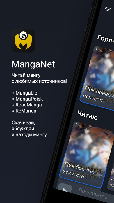
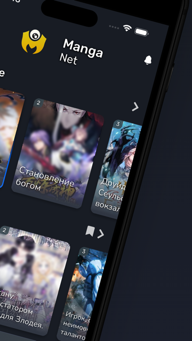
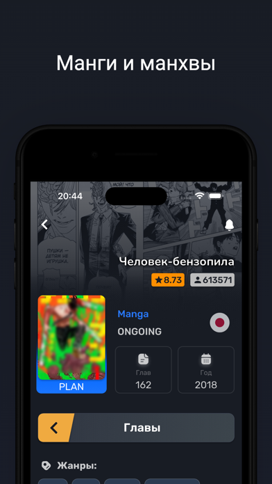
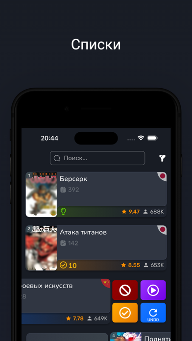
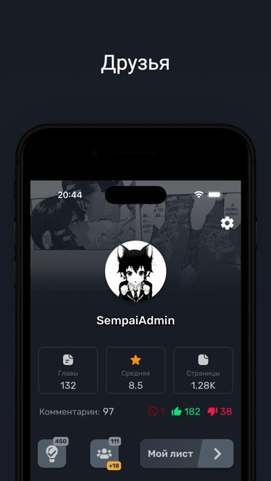
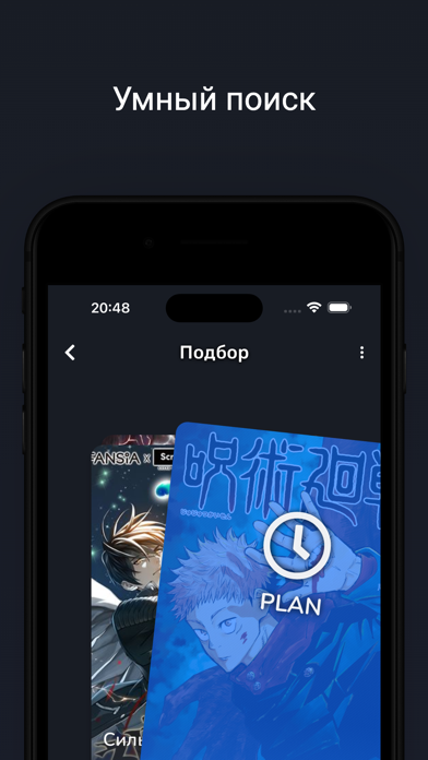
iPad screenshots


Icon palette
About this app
Приложение для чтения манги. Наслаждайся мангой на русском языке с любимых источников - MangaLib, Remanga, ReadManga и больше источников в будущем. MangaNet не просто парсер сайтов, в добавок к чтению манги, приложение имеет много удобных функций для поиска, обсуждения и составления списков манги. Полный список возможностей: - Удобная читалка - Скачивание и оффлайн режим - Поисковик - Фильтр - Уведомления - Обсуждения - Профиль с кучей информации - Свой список манги - История - Запоминание места последней остановки - Автоматическое подкачивание новых глав - Темы - Синхронизация списка с Shikimori и MyAnimeList - Подбор манги по интересам - Советы друзьям !!!ВАЖНО!!! ОТКАЗ ОТ ОТВЕТСТВЕННОСТИ: Все авторские права и товарные знаки принадлежат их авторам. Весь контент, представленный в приложении взят из открытых источников в Интернете на основе пользовательского соглашения источников. …
App details
What you can learn from MangaNet - Манга приложение
Every shipping app on the App Store has gone through the same decisions you're working through right now: which screenshot goes first, what caption sits over it, which device frame to show, what color the background should be. The 12 screenshots above are MangaNet - Манга приложение's answers to those questions — they're public, they're real, and they made it through Apple's review.
What the numbers say: MangaNet - Манга приложение runs a dark set with one background colour (#1C1C24) carried across every screenshot — the listing reads as a single poster when the shots sit side by side in search results. The accent colour we picked up, #DCB404, is the one to reuse for badges, arrows and highlighted words if you borrow this look. Hit Use this style to open the editor with these exact colours and drop your own screenshot in.
Notice the first screenshot in particular. It's the one users see in search results and on the product page, and it's where most apps spend their best caption and tightest design. Look at the proportion of background to phone, where the text sits, what one thing the image is trying to communicate.
Want to see how other Book apps approach the same problem? Browse more Book apps in the showcase.
Take what works into your own screenshots
Open LaunchShots and design your App Store & Google Play screenshots — pick a device frame, drop captions, ship in minutes. Free, in your browser.
Open the screenshot editor →Apps with a similar look
Closest background + accent colours among the listings we've analysed — useful when you want to see the same palette handled by a different team.