Chart position — tracked daily by LaunchShots
Screenshot style breakdown
Sampled from 5 of Timesheet: График рабочих смен's App Store screenshots — background, accent and theme, measured by LaunchShots (not something Apple publishes).
#FC9C04 bg
#DD8903
#F4D45C accent
#111111 text
Screenshots




iPad screenshots


Icon palette
About this app
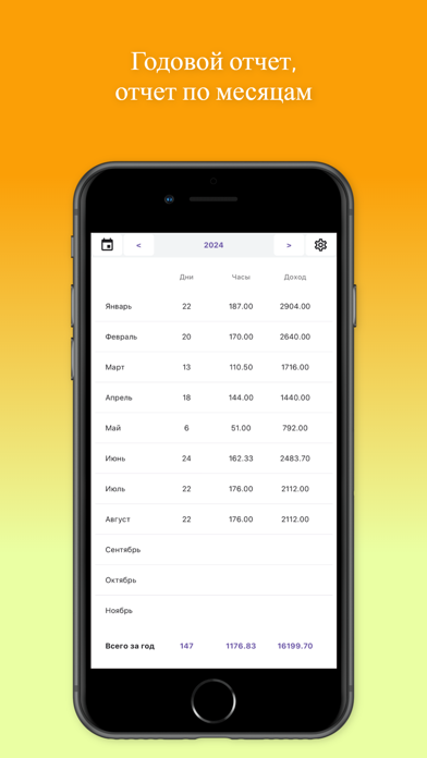
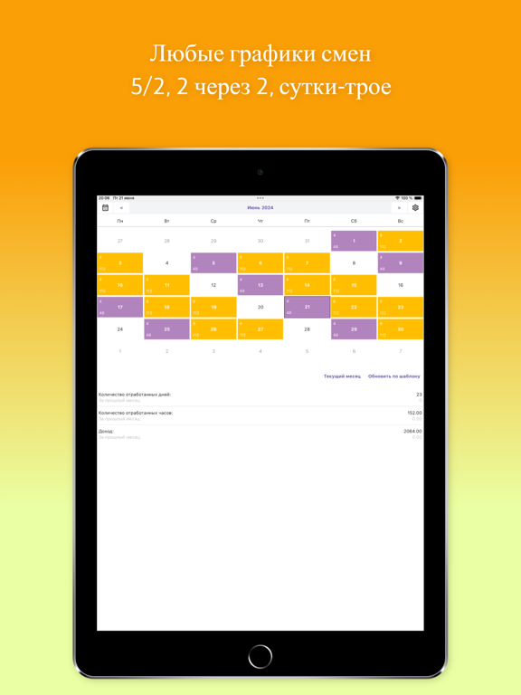
Приложение для учета отработанных часов и расчета заработной платы для работников с почасовой оплатой и гибким графиком. Фиксируйте рабочие часы и переработки в удобном календаре и приложение автоматически рассчитает ваш доход. Добавлена поддержка популярных графиков смен, таких как "два через два", "сутки трое". Подходит для работников вахтовым методом и со скользящим графиком. Календарь рабочего времени очень прост и удобен в использовании. Основные функции - Табель рабочего времени: ведение точного учета рабочих часов и дней в виде календаря. - Графики смен: поддержка популярных графиков работы, таких как "2 через 2" и "сутки трое". - Расчет оплаты труда: приложение автоматически рассчитывает заработок на основе введенных данных. - Заполнение по шаблону: сохраняются последние введенные данные для быстрого заполнения на последующие дни. - Статистика дохода: сравнение количества отра…
App details
What you can learn from Timesheet: График рабочих смен
Every shipping app on the App Store has gone through the same decisions you're working through right now: which screenshot goes first, what caption sits over it, which device frame to show, what color the background should be. The 10 screenshots above are Timesheet: График рабочих смен's answers to those questions — they're public, they're real, and they made it through Apple's review.
What the numbers say: Timesheet: График рабочих смен runs a light set with one background colour (#FC9C04) carried across every screenshot — the listing reads as a single poster when the shots sit side by side in search results. The accent colour we picked up, #F4D45C, is the one to reuse for badges, arrows and highlighted words if you borrow this look. Hit Use this style to open the editor with these exact colours and drop your own screenshot in.
Notice the first screenshot in particular. It's the one users see in search results and on the product page, and it's where most apps spend their best caption and tightest design. Look at the proportion of background to phone, where the text sits, what one thing the image is trying to communicate.
Want to see how other Productivity apps approach the same problem? Browse more Productivity apps in the showcase.
Take what works into your own screenshots
Open LaunchShots and design your App Store & Google Play screenshots — pick a device frame, drop captions, ship in minutes. Free, in your browser.
Open the screenshot editor →Apps with a similar look
Closest background + accent colours among the listings we've analysed — useful when you want to see the same palette handled by a different team.