Screenshot style breakdown
Sampled from 5 of AKPlayer's App Store screenshots — background, accent and theme, measured by LaunchShots (not something Apple publishes).
#1C1C1C bg
#3B3B3B
#FC3C3C accent
#FFFFFF text
Screenshots


Icon palette
About this app
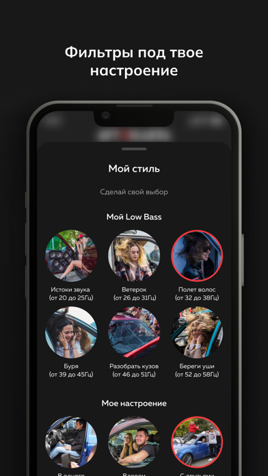
AKPlayer: Твой идеальный музыкальный спутник для автозвука! Откройте для себя AKPlayer — уникальное мобильное приложение, созданное специально для настоящих любителей автозвука! Забудьте о скучных плейлистах и некачественном звуке. С AKPlayer каждая поездка превратится в настоящее музыкальное путешествие! Преимущества AKPlayer: Идеальный звук для вашего авто: AKPlayer оптимизирован для воспроизведения музыки в автомобиле, обеспечивая чистое звучание и глубокие басы. Умные фильтры: Создайте атмосферу в дороге с помощью удобных фильтров для выбора музыки по настроению, жанру или битрейту. Избранное и подборки: Добавляйте любимые треки в избранное и создавайте свои собственные плейлисты. Мы также подготовили подборки, чтобы вы могли наслаждаться лучшей музыкой для авто на любой вкус. Простое управление: Удобный интерфейс позволяет переключать треки, регулировать громкость и управлять…
App details
What you can learn from AKPlayer
Every shipping app on the App Store has gone through the same decisions you're working through right now: which screenshot goes first, what caption sits over it, which device frame to show, what color the background should be. The 5 screenshots above are AKPlayer's answers to those questions — they're public, they're real, and they made it through Apple's review.
What the numbers say: AKPlayer runs a dark set with one background colour (#1C1C1C) carried across every screenshot — the listing reads as a single poster when the shots sit side by side in search results. The accent colour we picked up, #FC3C3C, is the one to reuse for badges, arrows and highlighted words if you borrow this look. Hit Use this style to open the editor with these exact colours and drop your own screenshot in.
Notice the first screenshot in particular. It's the one users see in search results and on the product page, and it's where most apps spend their best caption and tightest design. Look at the proportion of background to phone, where the text sits, what one thing the image is trying to communicate.
Want to see how other Music apps approach the same problem? Browse more Music apps in the showcase.
Take what works into your own screenshots
Open LaunchShots and design your App Store & Google Play screenshots — pick a device frame, drop captions, ship in minutes. Free, in your browser.
Open the screenshot editor →Apps with a similar look
Closest background + accent colours among the listings we've analysed — useful when you want to see the same palette handled by a different team.