Chart position — tracked daily by LaunchShots
Screenshot style breakdown
Sampled from 6 of 高情商键盘's App Store screenshots — background, accent and theme, measured by LaunchShots (not something Apple publishes).
#6C6CFC bg
#8080FC
#FC9CD4 accent
#FFFFFF text
Screenshots




Icon palette
About this app
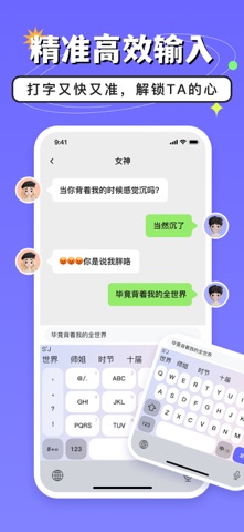
聊天常陷入被动,恋人生气不会哄? 高情商键盘来帮你!有了高情商键盘,让你的每一次回复都恰到好处,轻松化解尴尬,展现超高情商魅力。无论是职场交流,恋爱沟通,还是朋友互动,高情商键盘都是你的得力助手! 【高情商回复】一键复制对话,高情商人设帮回复 【轻松表达】随时润色表达,想说的话,聪明说 【人设市场】丰富聊天人设,帮你随时转变风格,玩转社交场 【聊天实战模拟】真实对话场景,检验你的聊天能力进步 【聊天技巧学习】绝对干货,用理论知识来帮助你 【自定义专属人设】专属定制,打造一个完美的你 【精准高效输入】打字又快又准,帮你解锁TA的心 ———————————————————————————————— 隐私政策:https://h.superclear.cn/appPro/keyboardAppletPartyclearPrivate.html 用户协议:https://h.superclear.cn/appPro/keyboardAppletUserAgreement.html
App details
What you can learn from 高情商键盘
Every shipping app on the App Store has gone through the same decisions you're working through right now: which screenshot goes first, what caption sits over it, which device frame to show, what color the background should be. The 6 screenshots above are 高情商键盘's answers to those questions — they're public, they're real, and they made it through Apple's review.
What the numbers say: 高情商键盘 runs a mixed light-and-dark set with one background colour (#6C6CFC) carried across every screenshot — the listing reads as a single poster when the shots sit side by side in search results. The accent colour we picked up, #FC9CD4, is the one to reuse for badges, arrows and highlighted words if you borrow this look. Hit Use this style to open the editor with these exact colours and drop your own screenshot in.
Notice the first screenshot in particular. It's the one users see in search results and on the product page, and it's where most apps spend their best caption and tightest design. Look at the proportion of background to phone, where the text sits, what one thing the image is trying to communicate.
Want to see how other Reference apps approach the same problem? Browse more Reference apps in the showcase.
Take what works into your own screenshots
Open LaunchShots and design your App Store & Google Play screenshots — pick a device frame, drop captions, ship in minutes. Free, in your browser.
Open the screenshot editor →Apps with a similar look
Closest background + accent colours among the listings we've analysed — useful when you want to see the same palette handled by a different team.