Chart position — tracked daily by LaunchShots
Screenshot style breakdown
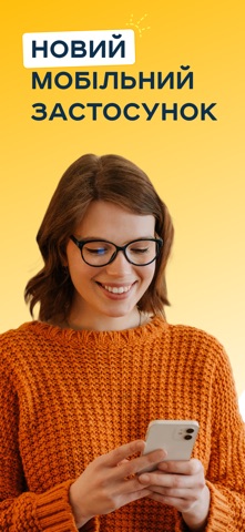
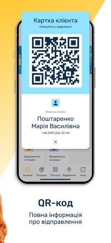
Sampled from 5 of Укрпошта 2.0's App Store screenshots — background, accent and theme, measured by LaunchShots (not something Apple publishes).
#FCC41C bg
#DDAC18
#FCDC7C accent
#111111 text
Screenshots


Icon palette
About this app
Укрпошта 2.0 — новий мобільний застосунок для трекінгу та відправки посилок в Україні та за кордон. Відстежуйте всі свої відправлення автоматично за номером телефону та створюйте нові відправки в кілька кліків. Ми зібрали ключові функції, щоб зробити роботу з посилками максимально швидкою та зручною. У новій версії застосунку доступні: - трекінг посилок — усі ваші відправлення з’являються автоматично, без потреби вводити трек-номери; - створення відправлень — формуйте накладні прямо в застосунку: по Україні та за кордон; - гнучкість і простота — створюйте посилки та міжнародні відправлення з доставкою у відділення або на адресу. Ми продовжуємо працювати над застосунком, додавати нові функції та покращувати інтерфейс. Але вже зараз встановіть та протестуйте ключовий функціонал. Поділіться відгуками — саме завдяки вам ми зробимо Укрпошту ще зручнішою. Чому варто спробувати «Укрпошта 2.0…
App details
What you can learn from Укрпошта 2.0
Every shipping app on the App Store has gone through the same decisions you're working through right now: which screenshot goes first, what caption sits over it, which device frame to show, what color the background should be. The 5 screenshots above are Укрпошта 2.0's answers to those questions — they're public, they're real, and they made it through Apple's review.
What the numbers say: Укрпошта 2.0 runs a light set where the background shifts from screenshot to screenshot (first shot #FCC41C) — each image has to stand on its own, so the captions carry more of the story. The accent colour we picked up, #FCDC7C, is the one to reuse for badges, arrows and highlighted words if you borrow this look. Hit Use this style to open the editor with these exact colours and drop your own screenshot in.
Notice the first screenshot in particular. It's the one users see in search results and on the product page, and it's where most apps spend their best caption and tightest design. Look at the proportion of background to phone, where the text sits, what one thing the image is trying to communicate.
Want to see how other Business apps approach the same problem? Browse more Business apps in the showcase.
Take what works into your own screenshots
Open LaunchShots and design your App Store & Google Play screenshots — pick a device frame, drop captions, ship in minutes. Free, in your browser.
Open the screenshot editor →Apps with a similar look
Closest background + accent colours among the listings we've analysed — useful when you want to see the same palette handled by a different team.