Chart position — tracked daily by LaunchShots
Screenshot style breakdown
Sampled from 5 of 漫想世界's App Store screenshots — background, accent and theme, measured by LaunchShots (not something Apple publishes).
#FC7C04 bg
#DD6D03
#BC8C5C accent
#111111 text
Screenshots


iPad screenshots
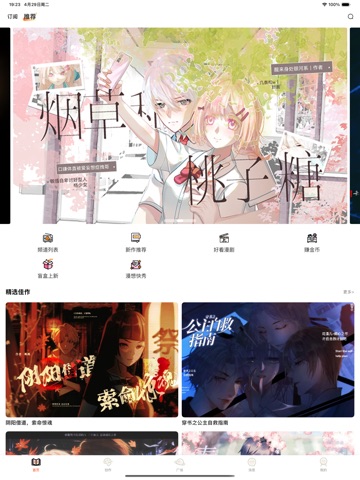
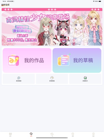
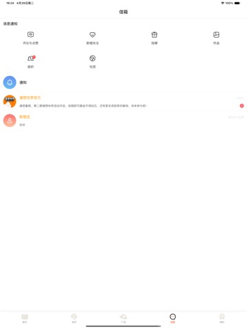
Icon palette
About this app
经过数月的努力,iOS版本现已上线。更棒的是,漫想世界已实现账号互通,您可以在不同类型的设备间自由登录! 让我们一起重新出发!无论你喜欢恋爱、纯爱、少女、古风、修真还是后宫、穿越、冒险、校园等剧情,这里都有丰富的国漫作品供你选择!在你灵感迸发的时候,海量高清素材任你使用,即使不会画画,有思想有故事的人亦可展现有趣的灵魂。在漫想世界,你不仅能畅快追漫,还能创作属于自己的角色和故事,扩列分享交流,与朋友一起沉浸在漫画的世界中。
App details
What you can learn from 漫想世界
Every shipping app on the App Store has gone through the same decisions you're working through right now: which screenshot goes first, what caption sits over it, which device frame to show, what color the background should be. The 8 screenshots above are 漫想世界's answers to those questions — they're public, they're real, and they made it through Apple's review.
What the numbers say: 漫想世界 runs a light set where the background shifts from screenshot to screenshot (first shot #FC7C04) — each image has to stand on its own, so the captions carry more of the story. The accent colour we picked up, #BC8C5C, is the one to reuse for badges, arrows and highlighted words if you borrow this look. Hit Use this style to open the editor with these exact colours and drop your own screenshot in.
Notice the first screenshot in particular. It's the one users see in search results and on the product page, and it's where most apps spend their best caption and tightest design. Look at the proportion of background to phone, where the text sits, what one thing the image is trying to communicate.
Want to see how other Book apps approach the same problem? Browse more Book apps in the showcase.
Take what works into your own screenshots
Open LaunchShots and design your App Store & Google Play screenshots — pick a device frame, drop captions, ship in minutes. Free, in your browser.
Open the screenshot editor →Apps with a similar look
Closest background + accent colours among the listings we've analysed — useful when you want to see the same palette handled by a different team.