Chart position — tracked daily by LaunchShots
Screenshot changes — detected by LaunchShots
Screenshot style breakdown
Sampled from 6 of Recify - Mijn Kook Recepten's App Store screenshots — background, accent and theme, measured by LaunchShots (not something Apple publishes).
#F44C24 bg
#F56542
#7C6C4C accent
#FFFFFF text
Screenshots

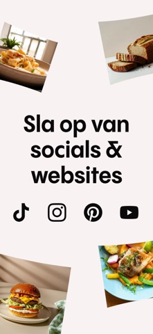


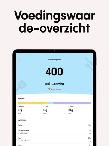
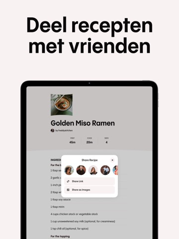
iPad screenshots




Icon palette
About this app
Recipe Keeper & Saver - Recify: Jouw Ultieme Kookboek Organisator & Manager Transformeer je kookervaring met Recify, de slimste receptenbewaarder en maaltijdplanner die vandaag beschikbaar is! Bewaar en organiseer al je favoriete recepten in één prachtig ontworpen digitaal kookboek. Raak nooit meer dat perfecte dineridee kwijt! De Ultieme Receptenbewaarder voor Voedselfanaten Verzamel en sla moeiteloos recepten op van sociale mediaplatforms en websites met slechts één tik. Onze krachtige AI-technologie transformeert zelfs de meest rommelige receptenposts direct in schone, georganiseerde kookboekformaten die je kookproces naadloos en plezierig maken. Jouw Persoonlijke Kookboekmanager Recify fungeert als jouw persoonlijke kookboekorganisator en manager, en helpt je om een uitgebreide digitale verzameling van je favoriete maaltijden op te bouwen. Of je nu een snelle doordeweekse maalt…
App details
What you can learn from Recify - Mijn Kook Recepten
Every shipping app on the App Store has gone through the same decisions you're working through right now: which screenshot goes first, what caption sits over it, which device frame to show, what color the background should be. The 16 screenshots above are Recify - Mijn Kook Recepten's answers to those questions — they're public, they're real, and they made it through Apple's review.
What the numbers say: Recify - Mijn Kook Recepten runs a mixed light-and-dark set where the background shifts from screenshot to screenshot (first shot #F44C24) — each image has to stand on its own, so the captions carry more of the story. The accent colour we picked up, #7C6C4C, is the one to reuse for badges, arrows and highlighted words if you borrow this look. Hit Use this style to open the editor with these exact colours and drop your own screenshot in.
Notice the first screenshot in particular. It's the one users see in search results and on the product page, and it's where most apps spend their best caption and tightest design. Look at the proportion of background to phone, where the text sits, what one thing the image is trying to communicate.
Want to see how other Food & Drink apps approach the same problem? Browse more Food & Drink apps in the showcase.
Take what works into your own screenshots
Open LaunchShots and design your App Store & Google Play screenshots — pick a device frame, drop captions, ship in minutes. Free, in your browser.
Open the screenshot editor →Apps with a similar look
Closest background + accent colours among the listings we've analysed — useful when you want to see the same palette handled by a different team.