Chart position — tracked daily by LaunchShots
Screenshot style breakdown
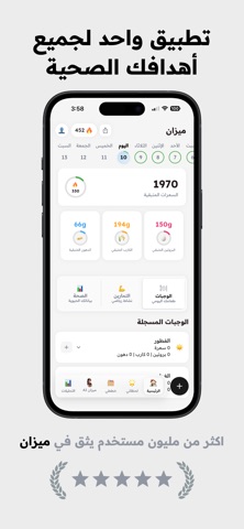
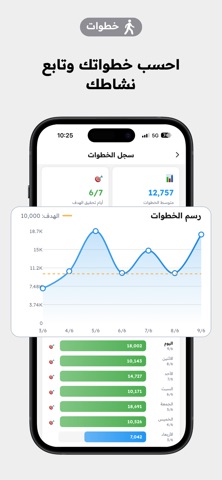
Sampled from 6 of Mezan ميزان's App Store screenshots — background, accent and theme, measured by LaunchShots (not something Apple publishes).
#ECECEC bg
#CFCFCF
#FCAC64 accent
#111111 text
Screenshots


Icon palette
About this app
تطبيق ميزان - رفيقك في رحلة الصحة واللياقة وش تسوي في تطبيق ميزان: ١) رد على كم سؤال بسيط عن حياتك نحسب لك احتياجك من السعرات والماكروز ٢) صور اكلك* ٣) شوف تحليل كامل للسعرات والعناصر الغذائية* ايش نقدم لك: تحليل دقيق لسعرات وماكروز أكلك من خلال الصور حساب احتياجك اليومي من السعرات والبروتين والكارب والدهون نتابع معك تقدمك يومياً نعطيك النتائج بشكل واضح وسهلة بنساعدك توصل للجسم اللي تبيه بأسرع وقت! ما نبيك تضيع وقتك في حساب السعرات والماكروز. هدفنا نسهل عليك متابعة أكلك وتحقق أهدافك، بس انت لازم تكون عندك العزيمة. احنا بنوفر لك كل المعلومات اللي تحتاجها في رحلتك. عندك سؤال او اقتراح؟ كلمنا على: help@mezan.io تنبيه: تطبيق ميزان ما يقدم استشارات طبية. كل توصياتنا هي مجرد اقتراحات، لازم تستشير دكتور وتبحث قبل لا تبدأ أي نظام غذائي جديد. *خدمة تحليل الوجبات للمشتركين بس. شروط الاستخدام والخصوصية: الشروط والأحكام: https://mezan.io/terms.html سياسة الخصوصية: https://mezan.io/privacy.ht…
App details
What you can learn from Mezan ميزان
Every shipping app on the App Store has gone through the same decisions you're working through right now: which screenshot goes first, what caption sits over it, which device frame to show, what color the background should be. The 6 screenshots above are Mezan ميزان's answers to those questions — they're public, they're real, and they made it through Apple's review.
What the numbers say: Mezan ميزان runs a light set with one background colour (#ECECEC) carried across every screenshot — the listing reads as a single poster when the shots sit side by side in search results. The accent colour we picked up, #FCAC64, is the one to reuse for badges, arrows and highlighted words if you borrow this look. Hit Use this style to open the editor with these exact colours and drop your own screenshot in.
Notice the first screenshot in particular. It's the one users see in search results and on the product page, and it's where most apps spend their best caption and tightest design. Look at the proportion of background to phone, where the text sits, what one thing the image is trying to communicate.
Want to see how other Health & Fitness apps approach the same problem? Browse more Health & Fitness apps in the showcase.
Take what works into your own screenshots
Open LaunchShots and design your App Store & Google Play screenshots — pick a device frame, drop captions, ship in minutes. Free, in your browser.
Open the screenshot editor →Apps with a similar look
Closest background + accent colours among the listings we've analysed — useful when you want to see the same palette handled by a different team.