Chart position — tracked daily by LaunchShots
Screenshot style breakdown
Sampled from 6 of United Insurance|تأمين المتحدة's App Store screenshots — background, accent and theme, measured by LaunchShots (not something Apple publishes).
#6C4CF4 bg
#8065F5
#FC945C accent
#FFFFFF text
Reading the caption text from the screenshots in your browser…
Screenshots


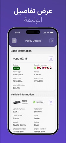


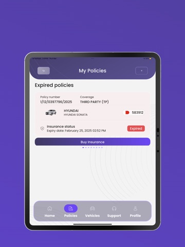
iPad screenshots
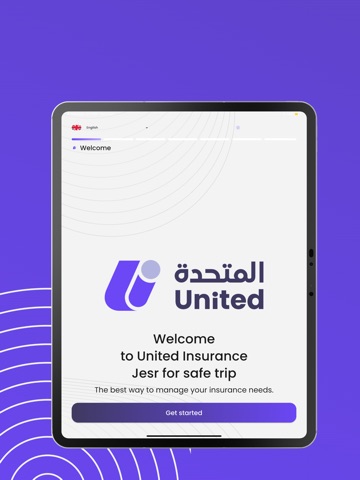
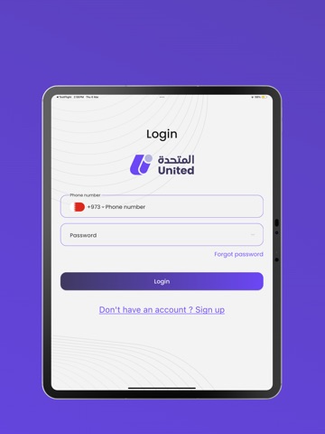



Icon palette
About this app
تقديم تطبيق شركة التأمين المتحدة الجديد كليًا! لقد قمنا بإعادة تصميم وتطوير تطبيقنا بالكامل لنقدم لك تجربة أسرع وأسهل وأكثر سلاسة. أصبح الآن شراء تأمينك عبر الإنترنت أكثر سهولة بفضل عملية الدفع المحسّنة وتحسين أداء التطبيق. استمتع بتصميم جديد تمامًا واكتشف مجموعة من الميزات الجديدة، بما في ذلك: تقديم المطالبات – قدّم وتتبع مطالباتك بكل سهولة. إدارة الوثائق – عدّل وحدث وثيقتك بأسرع طريقه . تقديم الشكاوى – ارفع استفساراتك مباشرة عبر التطبيق. اختبر الجيل الجديد من خدمات التأمين بين يديك! قم بتحميل التطبيق المحدث الآن. Introducing the All-New United Insurance App! We’ve completely redesigned and upgraded our app to give you a faster, smoother, and more convenient experience. Now, purchasing your insurance online is easier than ever, with an improved payment process and enhanced app performance. Enjoy a fresh new look and explore a range of new features, including: Claims Submission – …
App details
What you can learn from United Insurance|تأمين المتحدة
Every shipping app on the App Store has gone through the same decisions you're working through right now: which screenshot goes first, what caption sits over it, which device frame to show, what color the background should be. The 18 screenshots above are United Insurance|تأمين المتحدة's answers to those questions — they're public, they're real, and they made it through Apple's review.
What the numbers say: United Insurance|تأمين المتحدة runs a dark set where the background shifts from screenshot to screenshot (first shot #6C4CF4) — each image has to stand on its own, so the captions carry more of the story. The accent colour we picked up, #FC945C, is the one to reuse for badges, arrows and highlighted words if you borrow this look. Hit Use this style to open the editor with these exact colours and drop your own screenshot in.
Notice the first screenshot in particular. It's the one users see in search results and on the product page, and it's where most apps spend their best caption and tightest design. Look at the proportion of background to phone, where the text sits, what one thing the image is trying to communicate.
Want to see how other Travel apps approach the same problem? Browse more Travel apps in the showcase.
Take what works into your own screenshots
Open LaunchShots and design your App Store & Google Play screenshots — pick a device frame, drop captions, ship in minutes. Free, in your browser.
Open the screenshot editor →Apps with a similar look
Closest background + accent colours among the listings we've analysed — useful when you want to see the same palette handled by a different team.