Chart position — tracked daily by LaunchShots
Screenshot changes — detected by LaunchShots
Screenshot style breakdown
Sampled from 5 of Yapay Zeka Dünyası's App Store screenshots — background, accent and theme, measured by LaunchShots (not something Apple publishes).
#040404 bg
#272727
#946C54 accent
#FFFFFF text
- #1Yapay Zeka Araglari . fi Yapay Zeka Danigmanlan o | Farkli konularda uzmanlasmis yapay
- #3Metin Seslendirme Seslendirmek istediginiz metni buraya yazin...
- #4< YAPAY ZEKA DUNYA Sarki Al — Yapay zeka ile sarki sözleri olusturun. ’
- #5Yapay Zeka Danismanlari £ Genel Sohbet 2 Saglik Danismani
Captions read from the screenshots (OCR, may contain small errors): 4 headlines, 11 words on average (longest 14).
Screenshots

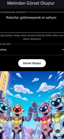


iPad screenshots

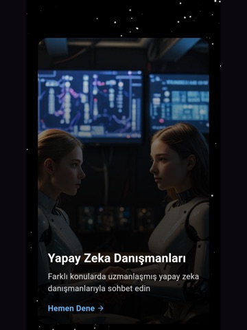

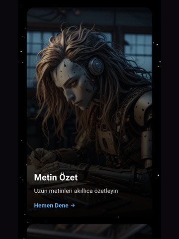
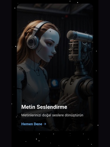
Icon palette
About this app
Kullanıma sunduğumuz AI araçlarıyla günlük hayatınızı kolaylaştırın ya da sadece eğlenin. ÖZELLİKLER: AI DANIŞMANLARI Yapay zeka ile konuşarak her şeyi sorabilirsiniz. Ödevlerinizi, araştırmalarınızı veya merak ettiğiniz ne varsa, yapay zeka danışmanlarımız sizin için saniyeler içinde yanıtlayacaktır. ÖNEMLİ UYARI: Bu uygulama sadece bilgilendirme amaçlıdır ve tıbbi tavsiye yerine geçmez. Herhangi bir tıbbi karar vermeden önce mutlaka doktorunuza danışınız. Uygulama içerisindeki sağlık ile ilgili bilgiler genel niteliktedir ve profesyonel tıbbi danışmanlık hizmeti olarak değerlendirilmemelidir. GÖRSEL OLUŞTURMA Aklınızdan geçen resmi bir kaç saniyede oluşturun. Çok basit, sadece görmek istediğiniz resmi kelimeler ile yazın, yapay zeka araçlarımız sizin için oluştursun. İstediğiniz türde resim oluşturabilirsiniz. Türler: Gerçekçi, anime, yağlı boya, dijital sanat, suluboya, kara…
App details
What you can learn from Yapay Zeka Dünyası
Every shipping app on the App Store has gone through the same decisions you're working through right now: which screenshot goes first, what caption sits over it, which device frame to show, what color the background should be. The 10 screenshots above are Yapay Zeka Dünyası's answers to those questions — they're public, they're real, and they made it through Apple's review.
What the numbers say: Yapay Zeka Dünyası runs a dark set with one background colour (#040404) carried across every screenshot — the listing reads as a single poster when the shots sit side by side in search results. The accent colour we picked up, #946C54, is the one to reuse for badges, arrows and highlighted words if you borrow this look. Hit Use this style to open the editor with these exact colours and drop your own screenshot in.
Notice the first screenshot in particular. It's the one users see in search results and on the product page, and it's where most apps spend their best caption and tightest design. Look at the proportion of background to phone, where the text sits, what one thing the image is trying to communicate.
Want to see how other Developer Tools apps approach the same problem? Browse more Developer Tools apps in the showcase.
Take what works into your own screenshots
Open LaunchShots and design your App Store & Google Play screenshots — pick a device frame, drop captions, ship in minutes. Free, in your browser.
Open the screenshot editor →Apps with a similar look
Closest background + accent colours among the listings we've analysed — useful when you want to see the same palette handled by a different team.