Chart position — tracked daily by LaunchShots
Screenshot style breakdown
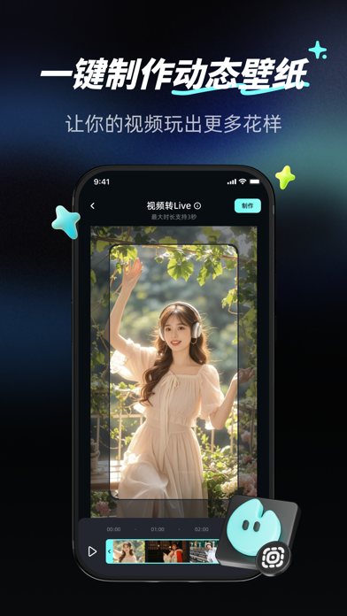
Sampled from 4 of 火花壁纸-锦鲤荷花沉浸式灵动壁纸's App Store screenshots — background, accent and theme, measured by LaunchShots (not something Apple publishes).
#0C0C14 bg
#2E2E34
#44747C accent
#FFFFFF text
Screenshots


Icon palette
About this app
在生活的匆匆步履中,我们用照片定格无数值得铭记的瞬间。那些人生照片,或是亲友相聚的欢笑、或是独自旅行的壮丽风景、又或是不经意间捕捉到的温暖画面,每一张都承载着独特的情感与故事,是生命中闪耀的火花瞬间。 【实况壁纸制作】 它是你将静态照片或视频转化为生动 Live 实况的魔法工具,让那些原本静止的画面 “动” 起来,重新焕发生机与活力。只需简单操作,即可将蕴含深刻意义的照片或精彩视频片段,一键制作成 Live 实况,为你留住转瞬即逝的美好,让每一次解锁手机,都仿佛再次置身于那个难忘瞬间。 【精选4k壁纸库】 无论你钟情于梦幻星空、壮阔海洋,还是充满艺术气息的抽象图案,在这里都能找到满足你个性需求的超高清动态壁纸。每一款壁纸都经过精心挑选与设计,以极致的画质和流畅的动态效果,为你的手机屏幕带来视觉盛宴。 火花壁纸让每一张人生照片、每一段记录火花瞬间的视频,都有了新的生命力。在这里,静态不再是限制,而是等待被激活的无限可能。 【自动订阅服务说明】 -订阅服务:根据所选的订阅计划,订阅按周/按年计费。 -订阅价格:…
App details
What you can learn from 火花壁纸-锦鲤荷花沉浸式灵动壁纸
Every shipping app on the App Store has gone through the same decisions you're working through right now: which screenshot goes first, what caption sits over it, which device frame to show, what color the background should be. The 4 screenshots above are 火花壁纸-锦鲤荷花沉浸式灵动壁纸's answers to those questions — they're public, they're real, and they made it through Apple's review.
What the numbers say: 火花壁纸-锦鲤荷花沉浸式灵动壁纸 runs a dark set with one background colour (#0C0C14) carried across every screenshot — the listing reads as a single poster when the shots sit side by side in search results. The accent colour we picked up, #44747C, is the one to reuse for badges, arrows and highlighted words if you borrow this look. Hit Use this style to open the editor with these exact colours and drop your own screenshot in.
Notice the first screenshot in particular. It's the one users see in search results and on the product page, and it's where most apps spend their best caption and tightest design. Look at the proportion of background to phone, where the text sits, what one thing the image is trying to communicate.
Want to see how other Utilities apps approach the same problem? Browse more Utilities apps in the showcase.
Take what works into your own screenshots
Open LaunchShots and design your App Store & Google Play screenshots — pick a device frame, drop captions, ship in minutes. Free, in your browser.
Open the screenshot editor →Apps with a similar look
Closest background + accent colours among the listings we've analysed — useful when you want to see the same palette handled by a different team.