Chart position — tracked daily by LaunchShots
Screenshot style breakdown
Sampled from 5 of Флиртби: знакомства рядом's App Store screenshots — background, accent and theme, measured by LaunchShots (not something Apple publishes).
#040404 bg
#272727
#642C0C accent
#FFFFFF text
Screenshots


iPad screenshots


Icon palette
About this app
Флиртби — знакомства, которые приводят к свиданиям. Познакомьтесь с людьми рядом и находите тех, с кем действительно есть химия: умные рекомендации, живой чат и общение, чтобы быстрее переходить от мэтча к встрече. Секреты знакомств: * Как привлечь внимание и начать разговор. * Эффективные советы для мужчин и женщин. * Ошибки, которых следует избегать на первом свидании. Умение строить крепкие отношения: * Как сохранять романтику и взаимопонимание в паре. * Рекомендации по решению конфликтов. * Поддержание баланса между личной жизнью и отношениями. Полезный контент и лайфхаки: * Как справляться с волнением перед свиданием. * Советы для успешного общения на разных этапах отношений. * Подготовка к долгосрочным отношениям и браку. Дополнительные возможности: * Сохранение любимых статей для быстрого доступа. * Удобная навигация по темам, чтобы вы всегда находили то, что нужно. *…
App details
What you can learn from Флиртби: знакомства рядом
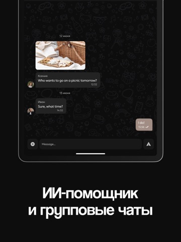
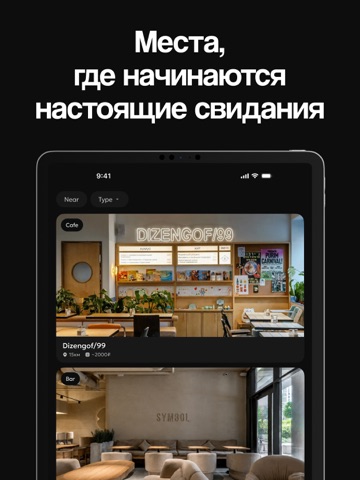
Every shipping app on the App Store has gone through the same decisions you're working through right now: which screenshot goes first, what caption sits over it, which device frame to show, what color the background should be. The 10 screenshots above are Флиртби: знакомства рядом's answers to those questions — they're public, they're real, and they made it through Apple's review.
What the numbers say: Флиртби: знакомства рядом runs a dark set with one background colour (#040404) carried across every screenshot — the listing reads as a single poster when the shots sit side by side in search results. The accent colour we picked up, #642C0C, is the one to reuse for badges, arrows and highlighted words if you borrow this look. Hit Use this style to open the editor with these exact colours and drop your own screenshot in.
Notice the first screenshot in particular. It's the one users see in search results and on the product page, and it's where most apps spend their best caption and tightest design. Look at the proportion of background to phone, where the text sits, what one thing the image is trying to communicate.
Want to see how other Social Networking apps approach the same problem? Browse more Social Networking apps in the showcase.
Take what works into your own screenshots
Open LaunchShots and design your App Store & Google Play screenshots — pick a device frame, drop captions, ship in minutes. Free, in your browser.
Open the screenshot editor →Apps with a similar look
Closest background + accent colours among the listings we've analysed — useful when you want to see the same palette handled by a different team.