Chart position — tracked daily by LaunchShots
Screenshot style breakdown
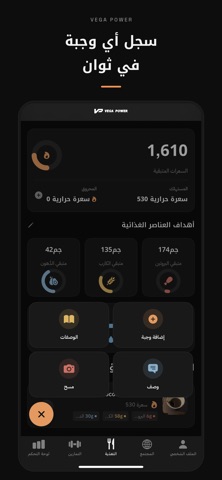
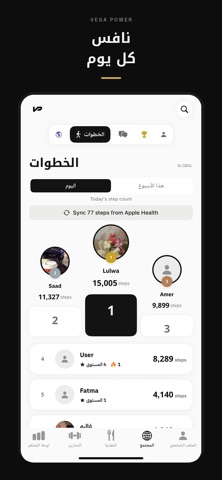
Sampled from 6 of Vega Power's App Store screenshots — background, accent and theme, measured by LaunchShots (not something Apple publishes).
#0C0C0C bg
#2E2E2E
#745C34 accent
#FFFFFF text
Reading the caption text from the screenshots in your browser…
Screenshots




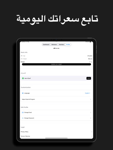
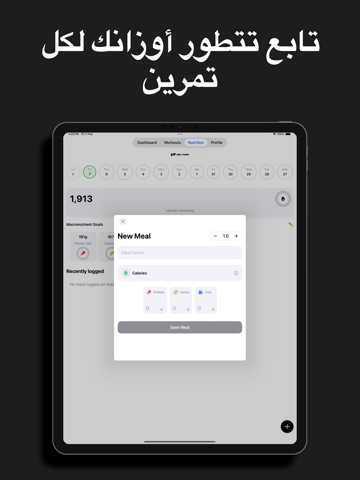
iPad screenshots



Icon palette
About this app
حوّل رحلتك نحو اللياقة البدنية مع ڤيقا باور - رفيقك الشامل للياقة البدنية والتغذية باللغة العربية. اكتشف قوة اللياقة البدنية المخصصة مع ڤيقا باور، تطبيق اللياقة البدنية والتغذية العربي الرائد المصمم خصيصاً للمجتمع العربي. سواء كنت تبدأ رحلتك في اللياقة البدنية أو تتطلع إلى الارتقاء بتدريبك إلى المستوى التالي، يوفر ڤيقا باور كل ما تحتاجه لتحقيق أهداف صحتك ولياقتك البدنية. الميزات الرئيسية: تمارين مخصصة • خطط تدريب مخصصة حسب أهدافك ومستوى لياقتك • عروض توضيحية عالية الجودة للتمارين مع تعليمات باللغة العربية • برامج تدريب تتطور معك • تتبع تقدمك مع سجل تدريب مفصل • خيارات التدريب في الصالة الرياضية والمنزل تغذية مبسطة • قاعدة بيانات شاملة للأطعمة العربية والعالمية • يومية طعام سهلة الاستخدام مع تتبع السعرات الحرارية • اقتراحات ذكية للوصفات حسب تفضيلاتك • تتبع العناصر الغذائية واستهلاك المياه اليومي تتبع التقدم • رسوم بيانية وتحليلات مرئية للتقدم • تتبع قياسات الجسم • تسجيل الوزن وتك…
App details
What you can learn from Vega Power
Every shipping app on the App Store has gone through the same decisions you're working through right now: which screenshot goes first, what caption sits over it, which device frame to show, what color the background should be. The 12 screenshots above are Vega Power's answers to those questions — they're public, they're real, and they made it through Apple's review.
What the numbers say: Vega Power runs a dark set with one background colour (#0C0C0C) carried across every screenshot — the listing reads as a single poster when the shots sit side by side in search results. The accent colour we picked up, #745C34, is the one to reuse for badges, arrows and highlighted words if you borrow this look. Hit Use this style to open the editor with these exact colours and drop your own screenshot in.
Notice the first screenshot in particular. It's the one users see in search results and on the product page, and it's where most apps spend their best caption and tightest design. Look at the proportion of background to phone, where the text sits, what one thing the image is trying to communicate.
Want to see how other Health & Fitness apps approach the same problem? Browse more Health & Fitness apps in the showcase.
Take what works into your own screenshots
Open LaunchShots and design your App Store & Google Play screenshots — pick a device frame, drop captions, ship in minutes. Free, in your browser.
Open the screenshot editor →Apps with a similar look
Closest background + accent colours among the listings we've analysed — useful when you want to see the same palette handled by a different team.