Chart position — tracked daily by LaunchShots
Screenshot changes — detected by LaunchShots
Screenshot style breakdown
Sampled from 5 of 每日听读-每日英语听读、教材同步、启蒙动画、双语名著精读等's App Store screenshots — background, accent and theme, measured by LaunchShots (not something Apple publishes).
#FCFCF4 bg
#DDDDD6
#FCB404 accent
#111111 text
- #3单 篇 循环 信 速 顺序 点 恋 复读 双语 跟 恋
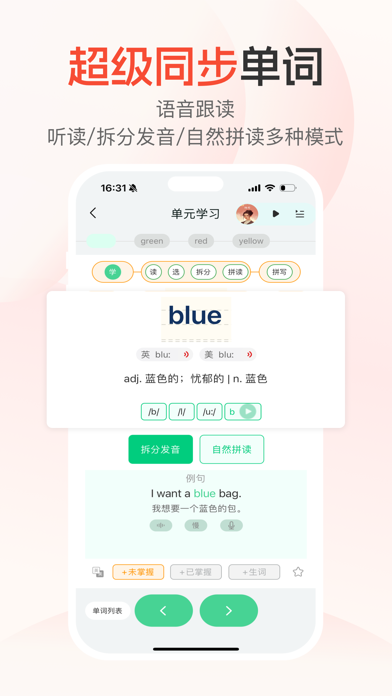
- #5我 想 要 一 个 蓝 色 的 包 。
Captions read from the screenshots (OCR, may contain small errors): 2 headlines, 11 words on average (longest 12).
Screenshots
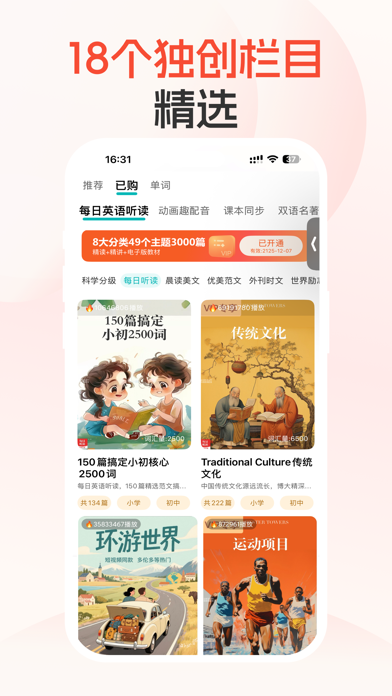
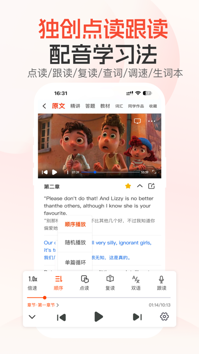
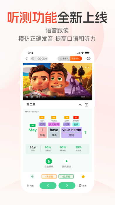
iPad screenshots


Icon palette
About this app
每日听读:点读跟读英语一点就通! 17个栏目,326个主题,50000篇音视频资源,点读跟读+AI解析精讲! 1,每日英语听读 2、双语名著精读 3、教材同步 4、历年真题 5、作文 6、口语 7、经典演讲 8、娱乐影音 9、精品课 10,英文绘本 11,分级动画 12,时文13,押题 14,晨读美文 15,用英语讲好中国 16,7天单词暴涨 17,艾宾浩斯记忆 重磅:开放了创作者中心和邀请中心。 推荐理由如下: 1,主题丰富,实时更新!(50%涉及传统文化符合新课标要求) 2,分级阅读 由易到难 3,0基础-1万核心词汇 4、短句到长难句逐句精讲 5、母语国家地道英文诵读 6,软件七大功能:点读/跟读/复读/查词/译文/调速/精讲 7,听力\阅读\词汇量\知识面全提高
App details
What you can learn from 每日听读-每日英语听读、教材同步、启蒙动画、双语名著精读等
Every shipping app on the App Store has gone through the same decisions you're working through right now: which screenshot goes first, what caption sits over it, which device frame to show, what color the background should be. The 10 screenshots above are 每日听读-每日英语听读、教材同步、启蒙动画、双语名著精读等's answers to those questions — they're public, they're real, and they made it through Apple's review.
What the numbers say: 每日听读-每日英语听读、教材同步、启蒙动画、双语名著精读等 runs a light set with one background colour (#FCFCF4) carried across every screenshot — the listing reads as a single poster when the shots sit side by side in search results. The accent colour we picked up, #FCB404, is the one to reuse for badges, arrows and highlighted words if you borrow this look. Hit Use this style to open the editor with these exact colours and drop your own screenshot in.
Notice the first screenshot in particular. It's the one users see in search results and on the product page, and it's where most apps spend their best caption and tightest design. Look at the proportion of background to phone, where the text sits, what one thing the image is trying to communicate.
Want to see how other Book apps approach the same problem? Browse more Book apps in the showcase.
Take what works into your own screenshots
Open LaunchShots and design your App Store & Google Play screenshots — pick a device frame, drop captions, ship in minutes. Free, in your browser.
Open the screenshot editor →Apps with a similar look
Closest background + accent colours among the listings we've analysed — useful when you want to see the same palette handled by a different team.