Chart position — tracked daily by LaunchShots
Screenshot changes — detected by LaunchShots
Screenshot style breakdown
Sampled from 6 of Momigo: Mẹ Bầu & Nuôi Con's App Store screenshots — background, accent and theme, measured by LaunchShots (not something Apple publishes).
#FCFCF4 bg
#DDDDD6
#F46494 accent
#111111 text
- #1Một ứng dụng cho cả 3 chặng Chuẩn bị mang thai — Mang thai — Chăm bé
- #2Hiểu nhịp cơ thể, nhẹ lòng hơn Theo dõi chu kỳ theo cách dịu dàng
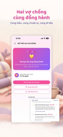
- #3H ~ Hai vợ chồng cùng đồng hành
- #4Theo dõi sự phát triển theo tuần thai Hôm nay con đang lớn lên thế nào?
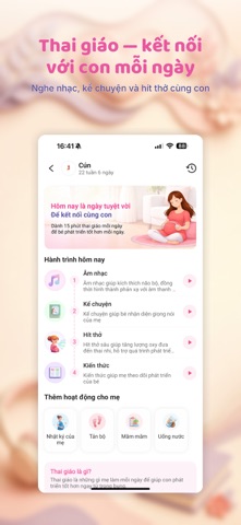
- #5Thai gido — két ndi với con môi ngày
- #6Kế hoạch di sinh — san sang đón con Túi đồ, giấy tờ va từng việc cần chuần bi
Captions read from the screenshots (OCR, may contain small errors): 6 headlines, 14 words on average (longest 19).
Screenshots





Icon palette
About this app
Mỗi ngày con lớn thêm một chút - Momigo giúp mẹ biết hôm nay con thế nào và mình nên làm gì. Từ thai kỳ đến chăm bé sau sinh, Momigo đồng hành cùng mẹ mỗi ngày với những thông tin dễ hiểu, gợi ý phù hợp và các nhắc lịch quan trọng theo từng giai đoạn của mẹ và bé. Dù mẹ đang mang thai những tuần đầu tiên, chuẩn bị sinh hay đang chăm bé sau sinh, Momigo giúp mẹ theo dõi hành trình làm mẹ rõ ràng hơn, nhẹ nhàng hơn và bớt cảm giác phải tự tìm kiếm quá nhiều thông tin rời rạc. HÔM NAY CON THẾ NÀO? Baby Today giúp mẹ theo dõi sự phát triển của con theo từng tuần thai hoặc giai đoạn phát triển của bé. Mẹ mở app là có thể biết hôm nay con đang thay đổi điều gì, mẹ cần lưu ý điều gì và có việc gì nên chuẩn bị trong ngày. GỢI Ý PHÙ HỢP THEO GIAI ĐOẠN Momigo không chỉ hiển thị thông tin chung chung. Ứng dụng gợi ý nội dung và việc cần làm dựa trên giai đoạn của mẹ và bé. Mẹ bầu ở từng tuần …
App details
What you can learn from Momigo: Mẹ Bầu & Nuôi Con
Every shipping app on the App Store has gone through the same decisions you're working through right now: which screenshot goes first, what caption sits over it, which device frame to show, what color the background should be. The 10 screenshots above are Momigo: Mẹ Bầu & Nuôi Con's answers to those questions — they're public, they're real, and they made it through Apple's review.
What the numbers say: Momigo: Mẹ Bầu & Nuôi Con runs a light set where the background shifts from screenshot to screenshot (first shot #FCFCF4) — each image has to stand on its own, so the captions carry more of the story. The accent colour we picked up, #F46494, is the one to reuse for badges, arrows and highlighted words if you borrow this look. Hit Use this style to open the editor with these exact colours and drop your own screenshot in.
Notice the first screenshot in particular. It's the one users see in search results and on the product page, and it's where most apps spend their best caption and tightest design. Look at the proportion of background to phone, where the text sits, what one thing the image is trying to communicate.
Want to see how other Health & Fitness apps approach the same problem? Browse more Health & Fitness apps in the showcase.
Take what works into your own screenshots
Open LaunchShots and design your App Store & Google Play screenshots — pick a device frame, drop captions, ship in minutes. Free, in your browser.
Open the screenshot editor →Apps with a similar look
Closest background + accent colours among the listings we've analysed — useful when you want to see the same palette handled by a different team.