Chart position — tracked daily by LaunchShots
Screenshot style breakdown
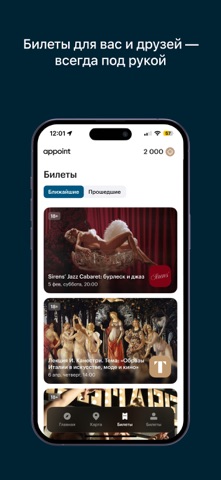
Sampled from 5 of appoint: бронирование билетов's App Store screenshots — background, accent and theme, measured by LaunchShots (not something Apple publishes).
#042434 bg
#274250
#447C84 accent
#FFFFFF text
Reading the caption text from the screenshots in your browser…
Screenshots




Icon palette
About this app
Добро пожаловать в appoint – ваш идеальный помощник для организации досуга всей семьи! Мы предлагаем удобный и интуитивно понятный сервис, который поможет вам легко находить и бронировать билеты на самые интересные мероприятия, а также записываться на услуги салонов и спортзалов. - Бронирование билетов: Узнайте о самых актуальных событиях в вашем городе – концерты, театры, выставки и спортивные мероприятия. С Appoint вы сможете быстро и удобно забронировать билеты в несколько кликов. - Услуги салонов: Ищете идеальное место для отдыха и ухода за собой? В нашем приложении вы найдете широкий выбор салонов красоты, спа и wellness-центров. Легко записывайтесь на процедуры и наслаждайтесь качественным обслуживанием. - Спортзалы и фитнес: Поддерживайте активный образ жизни с помощью нашего сервиса! Найдите ближайшие спортзалы, студии йоги или фитнес-классы, а также забронируйте занятия по …
App details
What you can learn from appoint: бронирование билетов
Every shipping app on the App Store has gone through the same decisions you're working through right now: which screenshot goes first, what caption sits over it, which device frame to show, what color the background should be. The 5 screenshots above are appoint: бронирование билетов's answers to those questions — they're public, they're real, and they made it through Apple's review.
What the numbers say: appoint: бронирование билетов runs a mixed light-and-dark set where the background shifts from screenshot to screenshot (first shot #042434) — each image has to stand on its own, so the captions carry more of the story. The accent colour we picked up, #447C84, is the one to reuse for badges, arrows and highlighted words if you borrow this look. Hit Use this style to open the editor with these exact colours and drop your own screenshot in.
Notice the first screenshot in particular. It's the one users see in search results and on the product page, and it's where most apps spend their best caption and tightest design. Look at the proportion of background to phone, where the text sits, what one thing the image is trying to communicate.
Want to see how other Lifestyle apps approach the same problem? Browse more Lifestyle apps in the showcase.
Take what works into your own screenshots
Open LaunchShots and design your App Store & Google Play screenshots — pick a device frame, drop captions, ship in minutes. Free, in your browser.
Open the screenshot editor →Apps with a similar look
Closest background + accent colours among the listings we've analysed — useful when you want to see the same palette handled by a different team.