Chart position — tracked daily by LaunchShots
Screenshot changes — detected by LaunchShots
Screenshot style breakdown
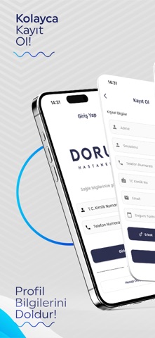
Sampled from 5 of Doruk's App Store screenshots — background, accent and theme, measured by LaunchShots (not something Apple publishes).
#DCDCDC bg
#C1C1C1
#0434D4 accent
#111111 text
- #2\ Profil \ Bilgilerini =
- #3J İlaç Takibini Cebinden Yap!
- #4Hastane ve Doktor Seçimini Yapin! p
Captions read from the screenshots (OCR, may contain small errors): 3 headlines, 5.3 words on average (longest 6).
Screenshots



Icon palette
About this app
Özel Doruk Hastaneleri Dijital Asistanıyla Tanışın Sağlığınızı yönetmek artık parmaklarınızın ucunda! Güvenli, hızlı ve pratik arayüzümüz sayesinde tüm işlemlerinizi tek bir uygulamada yapabilir, zamandan ve stresten tasarruf edebilirsiniz. Başlıca Özellikler: • Online Randevu Alma: Hekim ve poliklinik seçin, müsait tarih ve saatleri görüntüleyerek kolayca randevu oluşturun. Erteleme veya iptal işlemlerini tek dokunuşla yapın. • Tahlil Sonuçları Görüntüleme: Kan, idrar, radyoloji ve diğer laboratuvar sonuçlarını anında görüntüleyin. Geçmiş sonuçlarınızı grafiklerle karşılaştırın. • Reçete Takibi: Doktorunuzun yazdığı reçeteleri kaydedin, ilaçlarınızı takip edin. Bitmek üzere olan ilaçlar için otomatik hatırlatıcılar kurun. • Ziyaret Takibi: Hastane içindeki tüm ziyaretlerinizi kronolojik olarak görün; hangi doktora ne zaman gittiğinizi ve yapılan işlemleri kaydedin. • İlaç Hatırlatıcıl…
App details
What you can learn from Doruk
Every shipping app on the App Store has gone through the same decisions you're working through right now: which screenshot goes first, what caption sits over it, which device frame to show, what color the background should be. The 5 screenshots above are Doruk's answers to those questions — they're public, they're real, and they made it through Apple's review.
What the numbers say: Doruk runs a light set with one background colour (#DCDCDC) carried across every screenshot — the listing reads as a single poster when the shots sit side by side in search results. The accent colour we picked up, #0434D4, is the one to reuse for badges, arrows and highlighted words if you borrow this look. Hit Use this style to open the editor with these exact colours and drop your own screenshot in.
Notice the first screenshot in particular. It's the one users see in search results and on the product page, and it's where most apps spend their best caption and tightest design. Look at the proportion of background to phone, where the text sits, what one thing the image is trying to communicate.
Want to see how other Health & Fitness apps approach the same problem? Browse more Health & Fitness apps in the showcase.
Take what works into your own screenshots
Open LaunchShots and design your App Store & Google Play screenshots — pick a device frame, drop captions, ship in minutes. Free, in your browser.
Open the screenshot editor →Apps with a similar look
Closest background + accent colours among the listings we've analysed — useful when you want to see the same palette handled by a different team.