Chart position — tracked daily by LaunchShots
Screenshot style breakdown
Sampled from 6 of مافيا - لعبة الأدوار الجماعية's App Store screenshots — background, accent and theme, measured by LaunchShots (not something Apple publishes).
#DCDCF4 bg
#C1C1D6
#7C844C accent
#111111 text
Reading the caption text from the screenshots in your browser…
Screenshots





iPad screenshots


Icon palette
About this app
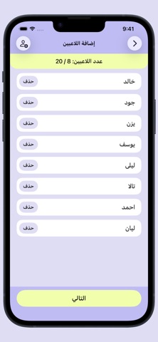
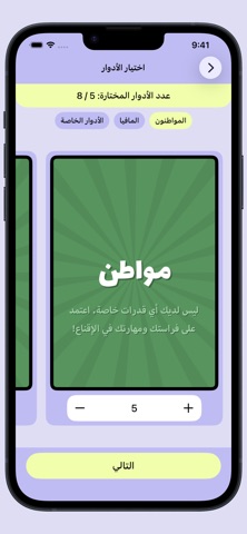
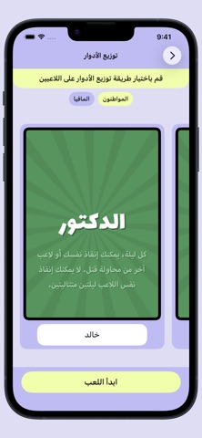
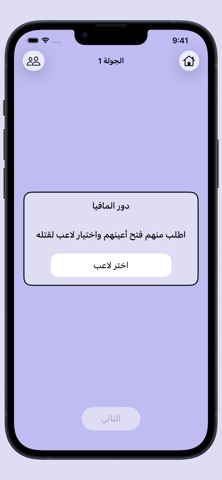
مافيا هي لعبة جماعية لتقمص الأدوار تختبر مهارتك في التخمين والاستنتاج! ينقسم اللاعبون فيها إلى فريقين: المواطنون والمافيا، ويسعى كل فريق للقضاء على الآخر، لكن التحدي هو أن هوية أعضاء الفريقين مجهولة. المواطنون لا يعرفون من هم المافيا ولكنهم يحاولون تخمينهم عبر جولات اللعب، بينما يعرف أعضاء المافيا بعضهم سرًا ويحاولون إخفاء هويتهم. - التجهيز للعب يبدأ مدير اللعبة بإضافة أسماء اللاعبين المشاركين، ثم ينتقل إلى اختيار الأدوار التي سيلعبون بها وطريقة توزيعها عليهم، وعند الضغط على "ابدأ اللعب" يطلب التطبيق من اللاعبين تمرير الجهاز بينهم ليعرف كل لاعب دوره بسرية. وبعد أن يعرف الجميع أدوارهم، يعود الجهاز إلى مدير اللعبة لبدء الجولة الأولى. - جولات اللعب تنقسم كل جولة إلى مرحلتين: • مرحلة الليل يطلب مدير اللعبة من جميع اللاعبين إغماض أعينهم، ثم يستدعي الأدوار التي تمتلك قدرات خاصة مثل المافيا والدكتور والمحقق، ليقوم كل منهم بتنفيذ دوره بسرية تامة. في هذه المرحلة تحدث جميع الأحداث الليلية بصم…
App details
What you can learn from مافيا - لعبة الأدوار الجماعية
Every shipping app on the App Store has gone through the same decisions you're working through right now: which screenshot goes first, what caption sits over it, which device frame to show, what color the background should be. The 18 screenshots above are مافيا - لعبة الأدوار الجماعية's answers to those questions — they're public, they're real, and they made it through Apple's review.
What the numbers say: مافيا - لعبة الأدوار الجماعية runs a light set with one background colour (#DCDCF4) carried across every screenshot — the listing reads as a single poster when the shots sit side by side in search results. The accent colour we picked up, #7C844C, is the one to reuse for badges, arrows and highlighted words if you borrow this look. Hit Use this style to open the editor with these exact colours and drop your own screenshot in.
Notice the first screenshot in particular. It's the one users see in search results and on the product page, and it's where most apps spend their best caption and tightest design. Look at the proportion of background to phone, where the text sits, what one thing the image is trying to communicate.
Want to see how other Games apps approach the same problem? Browse more Games apps in the showcase.
Take what works into your own screenshots
Open LaunchShots and design your App Store & Google Play screenshots — pick a device frame, drop captions, ship in minutes. Free, in your browser.
Open the screenshot editor →Apps with a similar look
Closest background + accent colours among the listings we've analysed — useful when you want to see the same palette handled by a different team.