Chart position — tracked daily by LaunchShots
Screenshot style breakdown
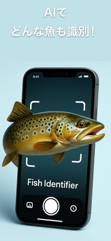
Sampled from 4 of 魚図鑑 – AI魚識別アプリ's App Store screenshots — background, accent and theme, measured by LaunchShots (not something Apple publishes).
#C4E4EC bg
#ACC8CF
#1C444C accent
#111111 text
Screenshots


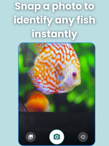
iPad screenshots


Icon palette
About this app
どこにいても魚を瞬時に識別 湖で釣りをしているときも、旅先で海の生き物を観察しているときも、「魚図鑑」を使えば魚種の識別がすばやく正確に行えます。写真を撮るか画像をアップロードするだけで、AI搭載エンジンが世界中の淡水魚・海水魚を数千種にわたり瞬時に認識します。 釣り人、ダイバー、趣味で魚に興味がある方、教育関係者にぴったり。スマホがポケットに入る魚類図鑑に変わります。 ● AIによる高精度な魚種識別 ● 生息地、食性、行動などの詳細情報 ● 識別した魚の個人ログを記録 ● オフラインでも使える — 電波のない釣り場でもOK ● 淡水魚・海水魚 数千種をカバー ● 持続可能な釣りと保全のためのヒント ● 初心者からプロまで使いやすいインターフェース ● 学生、教師、自然愛好家のための学習ツール なぜ「魚図鑑」を選ぶのか? 一般的な野生動物アプリと違い、本アプリは世界の魚種に特化してトレーニングされており、比類のない精度と詳細情報を提供します。 好奇心を持ち続けよう。責任ある行動を。 私たちは意識の向上と持続可能性を大切に…
App details
What you can learn from 魚図鑑 – AI魚識別アプリ
Every shipping app on the App Store has gone through the same decisions you're working through right now: which screenshot goes first, what caption sits over it, which device frame to show, what color the background should be. The 7 screenshots above are 魚図鑑 – AI魚識別アプリ's answers to those questions — they're public, they're real, and they made it through Apple's review.
What the numbers say: 魚図鑑 – AI魚識別アプリ runs a light set with one background colour (#C4E4EC) carried across every screenshot — the listing reads as a single poster when the shots sit side by side in search results. The accent colour we picked up, #1C444C, is the one to reuse for badges, arrows and highlighted words if you borrow this look. Hit Use this style to open the editor with these exact colours and drop your own screenshot in.
Notice the first screenshot in particular. It's the one users see in search results and on the product page, and it's where most apps spend their best caption and tightest design. Look at the proportion of background to phone, where the text sits, what one thing the image is trying to communicate.
Want to see how other Reference apps approach the same problem? Browse more Reference apps in the showcase.
Take what works into your own screenshots
Open LaunchShots and design your App Store & Google Play screenshots — pick a device frame, drop captions, ship in minutes. Free, in your browser.
Open the screenshot editor →Apps with a similar look
Closest background + accent colours among the listings we've analysed — useful when you want to see the same palette handled by a different team.