Chart position — tracked daily by LaunchShots
Screenshot style breakdown
Sampled from 4 of 音声リアルタイム翻訳's App Store screenshots — background, accent and theme, measured by LaunchShots (not something Apple publishes).
#349CDC bg
#50A9E0
#8CC4E4 accent
#FFFFFF text
Reading the caption text from the screenshots in your browser…
Screenshots

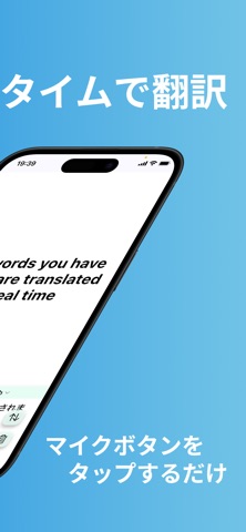
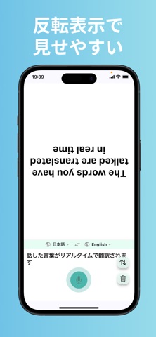
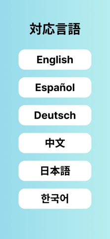
iPad screenshots


Icon palette
About this app
「リアルタイム翻訳」は、選択した2言語間で音声またはテキストをリアルタイムに翻訳する、シンプルかつ直感的な多言語コミュニケーションアプリです。 【主な特徴】 1. リアルタイム翻訳 マイクボタンをタップして話すか、入力欄にテキストを入力するだけで、即座に翻訳結果を表示します。 2. 正転/反転表示 翻訳文字を「通常表示(正転)」と「裏返し文字(反転)」で切り替え可能。相手に見せやすい表示が選べます。 3. ワンタップ切替 ソース言語とターゲット言語をワンタップで瞬時に入れ替え。往復の会話もスムーズに行えます。 4. 6言語対応 英語、日本語、中国語(簡体字)、スペイン語、フランス語、ドイツ語をサポート。 5. シンプルUI 不要な機能を省き、操作ステップは最小限。起動後すぐに翻訳を始められます。 【こんなシーンで活躍】 旅行先で現地の人と気軽にコミュニケーション ビジネスミーティングや展示会でスムーズに情報共有 語学学習の発音チェック・会話練習 国際交流イベントやオンラインチャットでの多言語コミュニケーション …
App details
What you can learn from 音声リアルタイム翻訳
Every shipping app on the App Store has gone through the same decisions you're working through right now: which screenshot goes first, what caption sits over it, which device frame to show, what color the background should be. The 8 screenshots above are 音声リアルタイム翻訳's answers to those questions — they're public, they're real, and they made it through Apple's review.
What the numbers say: 音声リアルタイム翻訳 runs a mixed light-and-dark set where the background shifts from screenshot to screenshot (first shot #349CDC) — each image has to stand on its own, so the captions carry more of the story. The accent colour we picked up, #8CC4E4, is the one to reuse for badges, arrows and highlighted words if you borrow this look. Hit Use this style to open the editor with these exact colours and drop your own screenshot in.
Notice the first screenshot in particular. It's the one users see in search results and on the product page, and it's where most apps spend their best caption and tightest design. Look at the proportion of background to phone, where the text sits, what one thing the image is trying to communicate.
Want to see how other Reference apps approach the same problem? Browse more Reference apps in the showcase.
Take what works into your own screenshots
Open LaunchShots and design your App Store & Google Play screenshots — pick a device frame, drop captions, ship in minutes. Free, in your browser.
Open the screenshot editor →Apps with a similar look
Closest background + accent colours among the listings we've analysed — useful when you want to see the same palette handled by a different team.