Chart position — tracked daily by LaunchShots
Screenshot changes — detected by LaunchShots
Screenshot style breakdown
Sampled from 6 of Exotic Bromo's App Store screenshots — background, accent and theme, measured by LaunchShots (not something Apple publishes).
#049C64 bg
#27A979
#0464CC accent
#FFFFFF text
Screenshots
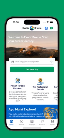
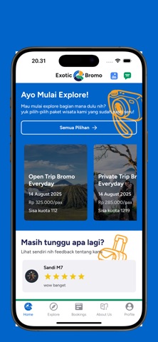

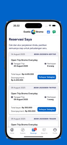
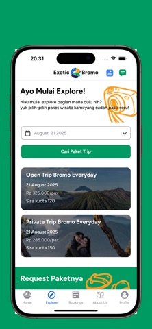

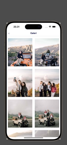
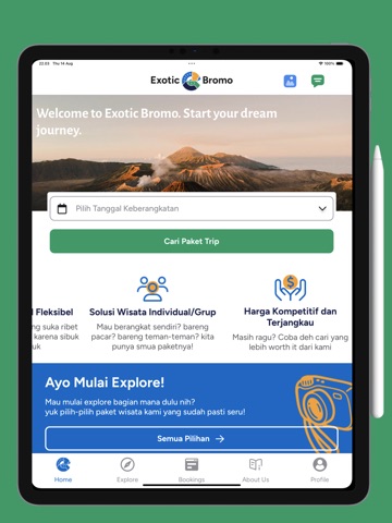
iPad screenshots


Icon palette
About this app
@exoticbromo adalah merek PT. Exotic Group Nusantara, sejak 2023. Travel agency profesional yang siap membawa pengalaman perjalanan tak terlupakan ke destinasi excotic , khususnya kawasan Bromo dan sekitarnya. Dengan ribuan pelanggan yang telah mempercayakan perjalanan mereka bersama kami, Exotic Bromo selalu berkomitmen untuk memberikan pelayanan terbaik, ramah, dan profesional. Kami tidak hanya menawarkan perjalanan, tetapi juga dokumentasi trip berkualitas tinggi yang akan mengabadikan setiap momen indah selama perjalanan Anda. Dengan tim fotografer dan videografer berpengalaman, setiap momen petualangan Anda akan terekam dengan sempurna.Selain itu, kami memahami pentingnya anggaran dalam setiap perjalanan. Oleh karena itu, Exotic Bromo hadir dengan harga trip yang ramah di kantong, tanpa mengurangi kualitas layanan dan kenyamanan yang Anda dapatkan.Bersama @exoticbromo, jadikan set…
App details
What you can learn from Exotic Bromo
Every shipping app on the App Store has gone through the same decisions you're working through right now: which screenshot goes first, what caption sits over it, which device frame to show, what color the background should be. The 11 screenshots above are Exotic Bromo's answers to those questions — they're public, they're real, and they made it through Apple's review.
What the numbers say: Exotic Bromo runs a dark set where the background shifts from screenshot to screenshot (first shot #049C64) — each image has to stand on its own, so the captions carry more of the story. The accent colour we picked up, #0464CC, is the one to reuse for badges, arrows and highlighted words if you borrow this look. Hit Use this style to open the editor with these exact colours and drop your own screenshot in.
Notice the first screenshot in particular. It's the one users see in search results and on the product page, and it's where most apps spend their best caption and tightest design. Look at the proportion of background to phone, where the text sits, what one thing the image is trying to communicate.
Want to see how other Travel apps approach the same problem? Browse more Travel apps in the showcase.
Take what works into your own screenshots
Open LaunchShots and design your App Store & Google Play screenshots — pick a device frame, drop captions, ship in minutes. Free, in your browser.
Open the screenshot editor →Apps with a similar look
Closest background + accent colours among the listings we've analysed — useful when you want to see the same palette handled by a different team.