Chart position — tracked daily by LaunchShots
Screenshot changes — detected by LaunchShots
Screenshot style breakdown
Sampled from 5 of X-Clash: サバイバル's App Store screenshots — background, accent and theme, measured by LaunchShots (not something Apple publishes).
#BCE4FC bg
#A5C8DD
#648CC4 accent
#111111 text
Screenshots


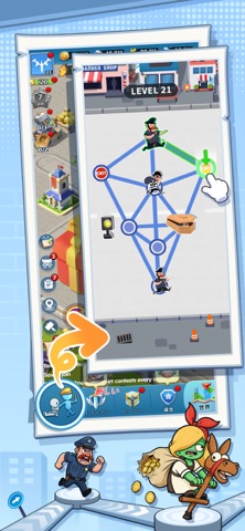
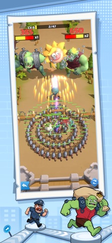

iPad screenshots


Icon palette
About this app
邪悪なる虚無が大陸を引き裂き、アンデッドの疫病が文明の最後の残滓を貪り尽くす!この二重の終末において、真に相応しき者のみが王国を再建できるのだ! この大災厄を生き抜くには、戦略的指揮と生存本能の両方を極めなければならない! チャンピオンたちへの助言:真の力は腕力にあらず、仲間との不屈の絆を築くことにある。賢明に仲間を集めよ——彼らの血統こそが勝利への鍵なのだ。 注目の特徴: - 複数の選択肢がある全く新しいレベル体験 - 片手操作で大陸を制覇せよ! - 謎を解き明かし、様々な戦略ゲームプレイを体験せよ - 収集とマッチングで虚無の謎を解き明かせ - 力を強化し、他者と同盟を結んで最大の支援を得よ!
App details
What you can learn from X-Clash: サバイバル
Every shipping app on the App Store has gone through the same decisions you're working through right now: which screenshot goes first, what caption sits over it, which device frame to show, what color the background should be. The 10 screenshots above are X-Clash: サバイバル's answers to those questions — they're public, they're real, and they made it through Apple's review.
What the numbers say: X-Clash: サバイバル runs a light set with one background colour (#BCE4FC) carried across every screenshot — the listing reads as a single poster when the shots sit side by side in search results. The accent colour we picked up, #648CC4, is the one to reuse for badges, arrows and highlighted words if you borrow this look. Hit Use this style to open the editor with these exact colours and drop your own screenshot in.
Notice the first screenshot in particular. It's the one users see in search results and on the product page, and it's where most apps spend their best caption and tightest design. Look at the proportion of background to phone, where the text sits, what one thing the image is trying to communicate.
Want to see how other Games apps approach the same problem? Browse more Games apps in the showcase.
Take what works into your own screenshots
Open LaunchShots and design your App Store & Google Play screenshots — pick a device frame, drop captions, ship in minutes. Free, in your browser.
Open the screenshot editor →Apps with a similar look
Closest background + accent colours among the listings we've analysed — useful when you want to see the same palette handled by a different team.