Chart position — tracked daily by LaunchShots
Screenshot style breakdown
Sampled from 5 of PieceOfJewelry's App Store screenshots — background, accent and theme, measured by LaunchShots (not something Apple publishes).
#2C1C34 bg
#493B50
#E4B494 accent
#FFFFFF text
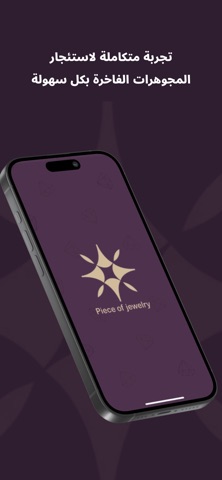
- #1تجربة متكاملة لاستئجار المجوهرات الفاخرة بكل سهولة
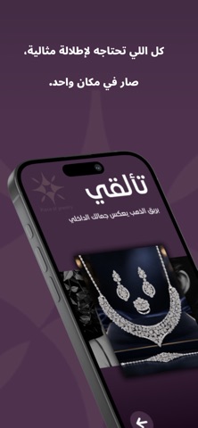
- #2صار في مكان واحد.
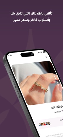
- #3بأسلوب فاخر وسعر مميز
- #4انضمي إلى elle من الفخامة والأناقة
Captions read from the screenshots (OCR, may contain small errors): 4 headlines, 5.3 words on average (longest 7).
Screenshots


Icon palette
About this app
تطبيق تأجير المجوهرات هو منصة رقمية مبتكرة تهدف إلى تسهيل تجربة استئجار المجوهرات بطريقة عصرية وآمنة، لتلبية احتياجات المناسبات الخاصة مثل حفلات الزفاف، الخطوبة، الحفلات الرسمية، أو حتى للاستخدام اليومي دون الحاجة لشراء المجوهرات بأسعارها المرتفعة. يوفر التطبيق تشكيلة واسعة من المجوهرات الفاخرة تشمل القلائد، الأساور، الخواتم، والحلي التقليدية والعصرية، من مختلف العيارات والتصاميم، بما يلبي جميع الأذواق. يتيح التطبيق للمستخدمين تصفح المجوهرات عبر واجهة سهلة الاستخدام، مع إمكانية اختيار مدة التأجير، تحديد تاريخ الاستلام والإرجاع، والاطلاع على تفاصيل كل قطعة من حيث الوزن، العيار، وتكلفة الإيجار. كما يدعم التطبيق أنظمة دفع إلكترونية آمنة ومتعددة لتوفير راحة ومرونة للمستخدمين. يهتم تطبيق تأجير المجوهرات بجودة الخدمة ورضا العملاء، لذلك يضمن نظافة المجوهرات وتعقيمها قبل كل استخدام. يمكن للمستخدمين أيضاً تقييم الخدمة وترك تعليقاتهم لتحسين التجربة بشكل مستمر. سواء كنت تبحث عن إطلالة فخمة لمناس…
App details
What you can learn from PieceOfJewelry
Every shipping app on the App Store has gone through the same decisions you're working through right now: which screenshot goes first, what caption sits over it, which device frame to show, what color the background should be. The 5 screenshots above are PieceOfJewelry's answers to those questions — they're public, they're real, and they made it through Apple's review.
What the numbers say: PieceOfJewelry runs a dark set with one background colour (#2C1C34) carried across every screenshot — the listing reads as a single poster when the shots sit side by side in search results. The accent colour we picked up, #E4B494, is the one to reuse for badges, arrows and highlighted words if you borrow this look. Hit Use this style to open the editor with these exact colours and drop your own screenshot in.
Notice the first screenshot in particular. It's the one users see in search results and on the product page, and it's where most apps spend their best caption and tightest design. Look at the proportion of background to phone, where the text sits, what one thing the image is trying to communicate.
Want to see how other Lifestyle apps approach the same problem? Browse more Lifestyle apps in the showcase.
Take what works into your own screenshots
Open LaunchShots and design your App Store & Google Play screenshots — pick a device frame, drop captions, ship in minutes. Free, in your browser.
Open the screenshot editor →Apps with a similar look
Closest background + accent colours among the listings we've analysed — useful when you want to see the same palette handled by a different team.