Chart position — tracked daily by LaunchShots
Screenshot changes — detected by LaunchShots
Screenshot style breakdown
Sampled from 6 of BuruVibe 振動強い バイブレーション's App Store screenshots — background, accent and theme, measured by LaunchShots (not something Apple publishes).
#1C1C1C bg
#3B3B3B
#F44CB4 accent
#FFFFFF text
Reading the caption text from the screenshots in your browser…
Screenshots



Icon palette
About this app
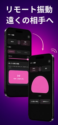
BuruVibe(ブルバイブ)は、iPhoneや対応ゲームコントローラーの振動と、環境音・BGMを組み合わせて楽しめるアプリです。 アカウント作成やログインは必要ありません。 主な機能 ・強さやリズムの異なる振動パターン ・自分だけのカスタム振動を作成・保存 ・雨音や焚き火などの環境音・BGM ・離れた相手に振動を送れる「リモート振動」 ・対応ゲームコントローラーへの振動出力 ・画面ロック中や他アプリ使用中のバックグラウンド再生 ・振動ロック、アプリアイコンの変更 リモート振動では、招待リンクや参加コードでつながり、リアルタイム、プリセット、カスタム振動を送れます。参加する側は無料です。 Premiumでは、リモート振動の招待作成、バックグラウンド再生、すべての振動とBGM、カスタム振動の無制限保存、広告の非表示などを利用できます。 ゲームコントローラー対応情報 https://buruvibe.com/support/game-controller/ 【重要】BuruVibeは医療機器ではありません。 本アプリは診断・治療・疾病予防を目的としたものではなく、一般的なリラクーシ…
App details
What you can learn from BuruVibe 振動強い バイブレーション
Every shipping app on the App Store has gone through the same decisions you're working through right now: which screenshot goes first, what caption sits over it, which device frame to show, what color the background should be. The 7 screenshots above are BuruVibe 振動強い バイブレーション's answers to those questions — they're public, they're real, and they made it through Apple's review.
What the numbers say: BuruVibe 振動強い バイブレーション runs a dark set where the background shifts from screenshot to screenshot (first shot #1C1C1C) — each image has to stand on its own, so the captions carry more of the story. The accent colour we picked up, #F44CB4, is the one to reuse for badges, arrows and highlighted words if you borrow this look. Hit Use this style to open the editor with these exact colours and drop your own screenshot in.
Notice the first screenshot in particular. It's the one users see in search results and on the product page, and it's where most apps spend their best caption and tightest design. Look at the proportion of background to phone, where the text sits, what one thing the image is trying to communicate.
Want to see how other Health & Fitness apps approach the same problem? Browse more Health & Fitness apps in the showcase.
Take what works into your own screenshots
Open LaunchShots and design your App Store & Google Play screenshots — pick a device frame, drop captions, ship in minutes. Free, in your browser.
Open the screenshot editor →Apps with a similar look
Closest background + accent colours among the listings we've analysed — useful when you want to see the same palette handled by a different team.