Chart position — tracked daily by LaunchShots
Screenshot style breakdown
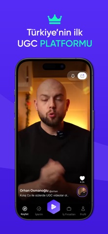
Sampled from 5 of Kolaj Co Creator's App Store screenshots — background, accent and theme, measured by LaunchShots (not something Apple publishes).
#14F4BC bg
#11D6A5
#0CAC84 accent
#111111 text
Screenshots




Icon palette
About this app
Kolaj Co, içerik üreticileri ile markaları bir araya getiren, yaratıcı UGC (User-Generated Content) videolar üzerinden kazanç sağlamanı mümkün kılan bir mobil uygulamadır. Markaların pazarlama kampanyaları için doğal ve özgün videolar üret, yeteneklerini paraya dönüştür! Neler Yapabilirsin? • Video görevlerini keşfet ve başvur • Brief’leri inceleyerek ne çekmen gerektiğini kolayca öğren • Videonu yükle, varsa revizeleri hızlıca tamamla • Onaylanan videolarla kazancını düzenli olarak al Senin İçin Uygun mu? Kolaj, video çekmeyi seven, doğal kamera önü performansı olan ve markalarla çalışmak isteyen herkes için uygundur. Deneyimli bir içerik üretici olman gerekmez — sadece yaratıcılığını ve enerjini katman yeterli. Avantajlar: • Şeffaf brief sistemi • Kolay kullanım • Zamanında ödeme • Yaratıcılığı destekleyen sistem • Yüzlerce farklı marka ile iş birliği fırsatı Kolaj Co ile kendi ta…
App details
What you can learn from Kolaj Co Creator
Every shipping app on the App Store has gone through the same decisions you're working through right now: which screenshot goes first, what caption sits over it, which device frame to show, what color the background should be. The 5 screenshots above are Kolaj Co Creator's answers to those questions — they're public, they're real, and they made it through Apple's review.
What the numbers say: Kolaj Co Creator runs a mixed light-and-dark set where the background shifts from screenshot to screenshot (first shot #14F4BC) — each image has to stand on its own, so the captions carry more of the story. The accent colour we picked up, #0CAC84, is the one to reuse for badges, arrows and highlighted words if you borrow this look. Hit Use this style to open the editor with these exact colours and drop your own screenshot in.
Notice the first screenshot in particular. It's the one users see in search results and on the product page, and it's where most apps spend their best caption and tightest design. Look at the proportion of background to phone, where the text sits, what one thing the image is trying to communicate.
Want to see how other Business apps approach the same problem? Browse more Business apps in the showcase.
Take what works into your own screenshots
Open LaunchShots and design your App Store & Google Play screenshots — pick a device frame, drop captions, ship in minutes. Free, in your browser.
Open the screenshot editor →Apps with a similar look
Closest background + accent colours among the listings we've analysed — useful when you want to see the same palette handled by a different team.