Chart position — tracked daily by LaunchShots
Screenshot style breakdown
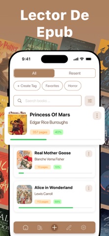
Sampled from 6 of Lector y Visor de ePub's App Store screenshots — background, accent and theme, measured by LaunchShots (not something Apple publishes).
#AC845C bg
#B79572
#54BC6C accent
#FFFFFF text
Reading the caption text from the screenshots in your browser…
Screenshots


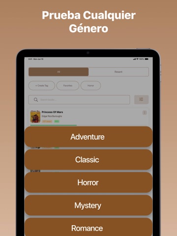
iPad screenshots




Icon palette
About this app
Nuestra app es una aplicación móvil versátil diseñada para descargar y leer libros electrónicos y documentos con facilidad. Es compatible con una amplia gama de formatos, incluyendo EPUB, PDF, TXT, DOC, DOCX y ODT, así como archivos ZIP y RAR para su extracción y lectura directa. Los usuarios pueden importar archivos a través del navegador, AirDrop, iCloud, Finder y otras apps, lo que permite un acceso fluido en todos los dispositivos. La app ofrece una navegación intuitiva con exploración de capítulos, personalización de fuentes, temas, control de brillo, marcadores y notas. Los usuarios de la versión gratuita pueden disfrutar de hasta cinco libros y notas, formatos básicos y un tema claro con dos opciones de fuente. La versión PRO desbloquea libros y notas ilimitados, compatibilidad con formatos avanzados, integración de widgets y una mayor personalización de la lectura. Tanto si eres…
App details
What you can learn from Lector y Visor de ePub
Every shipping app on the App Store has gone through the same decisions you're working through right now: which screenshot goes first, what caption sits over it, which device frame to show, what color the background should be. The 14 screenshots above are Lector y Visor de ePub's answers to those questions — they're public, they're real, and they made it through Apple's review.
What the numbers say: Lector y Visor de ePub runs a mixed light-and-dark set where the background shifts from screenshot to screenshot (first shot #AC845C) — each image has to stand on its own, so the captions carry more of the story. The accent colour we picked up, #54BC6C, is the one to reuse for badges, arrows and highlighted words if you borrow this look. Hit Use this style to open the editor with these exact colours and drop your own screenshot in.
Notice the first screenshot in particular. It's the one users see in search results and on the product page, and it's where most apps spend their best caption and tightest design. Look at the proportion of background to phone, where the text sits, what one thing the image is trying to communicate.
Want to see how other Book apps approach the same problem? Browse more Book apps in the showcase.
Take what works into your own screenshots
Open LaunchShots and design your App Store & Google Play screenshots — pick a device frame, drop captions, ship in minutes. Free, in your browser.
Open the screenshot editor →Apps with a similar look
Closest background + accent colours among the listings we've analysed — useful when you want to see the same palette handled by a different team.