Chart position — tracked daily by LaunchShots
Screenshot changes — detected by LaunchShots
Screenshot style breakdown
Sampled from 6 of Car Auto Play: Sync & Connect's App Store screenshots — background, accent and theme, measured by LaunchShots (not something Apple publishes).
#040404 bg
#272727
#04AC24 accent
#FFFFFF text
- #1CarPlay voor elke auto
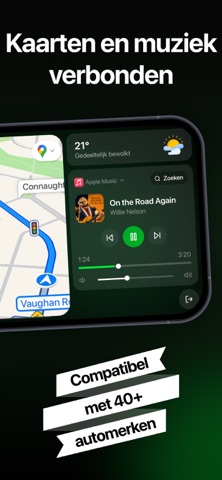
- #2Kaarten en muziek verbonden
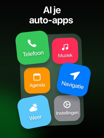
- #3Alje auto-apps
- #4Alles over jouw auto
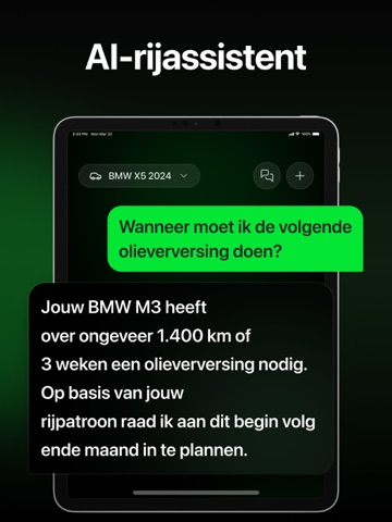
- #5Al-rijassistent
- #6Vertrouwd door meer dan 1Mritten
Captions read from the screenshots (OCR, may contain small errors): 6 headlines, 3.3 words on average (longest 5).
Screenshots



iPad screenshots




Icon palette
About this app
Maak van je iPhone een slimmer rijscherm Breng een moderne auto-ervaring naar je iPhone met een overzichtelijk, bestuurdersvriendelijk dashboard ontworpen voor navigatie, muziek, gesprekken en dagelijkse rij-essentials. Geniet van een strakke interface die natuurlijk aanvoelt achter het stuur en elke rit gemakkelijker, verbonden en plezieriger maakt. Of je nu dagelijks rijdt, roadtrips maakt of gewoon een slimmere setup in je auto wilt, Car Play Auto helpt je telefoon binnen enkele minuten te veranderen in een krachtige rijgezel. Belangrijkste kenmerken: • Slim rijdashboard Een overzichtelijke, gebruiksvriendelijke interface met grote bedieningselementen voor snelle toegang tijdens het rijden. • Klaar voor navigatie Gebruik je favoriete navigatie-apps zoals Apple Maps, Google Maps of Waze voor gedetailleerde routebeschrijvingen. • Muziek- en mediabediening Open muziek, podcasts en…
App details
What you can learn from Car Auto Play: Sync & Connect
Every shipping app on the App Store has gone through the same decisions you're working through right now: which screenshot goes first, what caption sits over it, which device frame to show, what color the background should be. The 12 screenshots above are Car Auto Play: Sync & Connect's answers to those questions — they're public, they're real, and they made it through Apple's review.
What the numbers say: Car Auto Play: Sync & Connect runs a dark set with one background colour (#040404) carried across every screenshot — the listing reads as a single poster when the shots sit side by side in search results. The accent colour we picked up, #04AC24, is the one to reuse for badges, arrows and highlighted words if you borrow this look. Hit Use this style to open the editor with these exact colours and drop your own screenshot in.
Notice the first screenshot in particular. It's the one users see in search results and on the product page, and it's where most apps spend their best caption and tightest design. Look at the proportion of background to phone, where the text sits, what one thing the image is trying to communicate.
Want to see how other Utilities apps approach the same problem? Browse more Utilities apps in the showcase.
Take what works into your own screenshots
Open LaunchShots and design your App Store & Google Play screenshots — pick a device frame, drop captions, ship in minutes. Free, in your browser.
Open the screenshot editor →Apps with a similar look
Closest background + accent colours among the listings we've analysed — useful when you want to see the same palette handled by a different team.