Screenshot changes — detected by LaunchShots
Screenshot style breakdown
Sampled from 4 of 脉安 - 你的健康生活助手's App Store screenshots — background, accent and theme, measured by LaunchShots (not something Apple publishes).
#0474FC bg
#2787FC
#94CCFC accent
#FFFFFF text
Screenshots



Icon palette
About this app
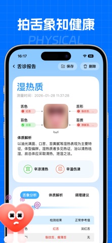
摄像头测心率·全面健康管理 【摄像头测心率,30秒快速检测】 无需额外硬件设备,依托手机摄像头即可实现心率精准检测,仅需将指尖轻贴摄像头区域,启动检测后30秒内完成数据采集与分析,实时生成心率检测结果,直观呈现当前心率数值,适配日常居家、办公、外出等多场景的快速心率监测需求,为健康状态判断提供便捷、无接触的基础数据支撑。 【舌诊测量,智能分析舌象健康】 通过机器学习、深度学习神经网络算法,打造居家便捷式舌象健康分析功能。只需按照指引,在光线充足环境下拍摄清晰舌象照片,系统将自动识别舌质、舌苔等核心特征,通过大数据算法对舌象进行智能分析,快速生成舌象健康解读报告,指出潜在健康问题并给出针对性的调理建议,让用户能轻松完成舌诊自测。 【全景健康数据看板,关键数据一目了然】 集中展示心率、HRV、BMI 等核心体征指标,搭配BMI指标解读,让你快速掌握身体基础状况;自动同步每日运动数据,步数、步行距离、能量消耗实时更新,运动成果清晰可见;所有数据一站式整合,帮你建立持续的健康追踪习惯,轻松管理日常健康。 重要声明 …
App details
What you can learn from 脉安 - 你的健康生活助手
Every shipping app on the App Store has gone through the same decisions you're working through right now: which screenshot goes first, what caption sits over it, which device frame to show, what color the background should be. The 4 screenshots above are 脉安 - 你的健康生活助手's answers to those questions — they're public, they're real, and they made it through Apple's review.
What the numbers say: 脉安 - 你的健康生活助手 runs a dark set with one background colour (#0474FC) carried across every screenshot — the listing reads as a single poster when the shots sit side by side in search results. The accent colour we picked up, #94CCFC, is the one to reuse for badges, arrows and highlighted words if you borrow this look. Hit Use this style to open the editor with these exact colours and drop your own screenshot in.
Notice the first screenshot in particular. It's the one users see in search results and on the product page, and it's where most apps spend their best caption and tightest design. Look at the proportion of background to phone, where the text sits, what one thing the image is trying to communicate.
Want to see how other Health & Fitness apps approach the same problem? Browse more Health & Fitness apps in the showcase.
Take what works into your own screenshots
Open LaunchShots and design your App Store & Google Play screenshots — pick a device frame, drop captions, ship in minutes. Free, in your browser.
Open the screenshot editor →Apps with a similar look
Closest background + accent colours among the listings we've analysed — useful when you want to see the same palette handled by a different team.