Chart position — tracked daily by LaunchShots
Screenshot changes — detected by LaunchShots
Screenshot style breakdown
Sampled from 6 of Бибибайк — шеринг bb.bike's App Store screenshots — background, accent and theme, measured by LaunchShots (not something Apple publishes).
#64DC54 bg
#58C149
#04942C accent
#111111 text
Screenshots


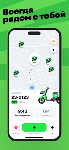
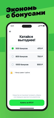
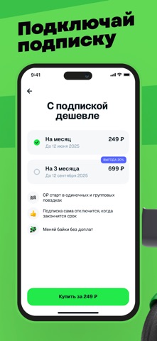
Icon palette
About this app
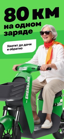
Выбирай бибибайк на карте и поехали. Для езды на наших электробайках не нужны водительские права и документы. На карте в приложении отмечены все наши электробайки, доступные для аренды. Они ярко-зелёные, других таких нет, ты не ошибёшься. АРЕНДОВАТЬ ЛЕГКО Найди бибибайк на карте, отсканируй QR-код на руле через приложение и привяжи карту. Нажми «Начать поездку» и катайся. Все просто! НАМ ЕСТЬ, ЧТО РАССКАЗАТЬ + Максимальная скорость: 25 км/ч + Запас хода: до 80 км + Время работы на одном заряде: до 4 часов + Корзина на 5 кг: поместится всё, что нужно + Можно арендовать несколько бибибайков и кататься семьей + Комфортнее других видов кикшеринга + Подходит для любых целей: прогулки, поездки по делам и за покупками, или активный отдых НОВЫЙ ФОРМАТ ГОРОДСКОГО ШЕРИНГА bb.bike это не просто ещё один сервис аренды транспорта. Мы предлагаем новый формат шеринга — электробайки, которые эрго…
App details
What you can learn from Бибибайк — шеринг bb.bike
Every shipping app on the App Store has gone through the same decisions you're working through right now: which screenshot goes first, what caption sits over it, which device frame to show, what color the background should be. The 7 screenshots above are Бибибайк — шеринг bb.bike's answers to those questions — they're public, they're real, and they made it through Apple's review.
What the numbers say: Бибибайк — шеринг bb.bike runs a light set with one background colour (#64DC54) carried across every screenshot — the listing reads as a single poster when the shots sit side by side in search results. The accent colour we picked up, #04942C, is the one to reuse for badges, arrows and highlighted words if you borrow this look. Hit Use this style to open the editor with these exact colours and drop your own screenshot in.
Notice the first screenshot in particular. It's the one users see in search results and on the product page, and it's where most apps spend their best caption and tightest design. Look at the proportion of background to phone, where the text sits, what one thing the image is trying to communicate.
Want to see how other Travel apps approach the same problem? Browse more Travel apps in the showcase.
Take what works into your own screenshots
Open LaunchShots and design your App Store & Google Play screenshots — pick a device frame, drop captions, ship in minutes. Free, in your browser.
Open the screenshot editor →Apps with a similar look
Closest background + accent colours among the listings we've analysed — useful when you want to see the same palette handled by a different team.