Chart position — tracked daily by LaunchShots
Screenshot style breakdown
Sampled from 5 of 潮汐实时预报 - 精准潮汐查询, 赶海钓鱼助手与出海天气指南's App Store screenshots — background, accent and theme, measured by LaunchShots (not something Apple publishes).
#94C4FC bg
#82ACDD
#5484FC accent
#111111 text
Screenshots
Icon palette
About this app
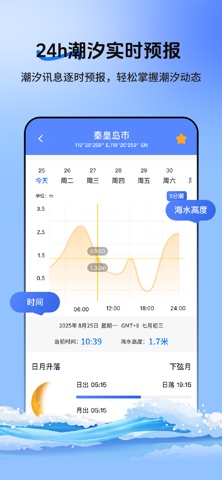
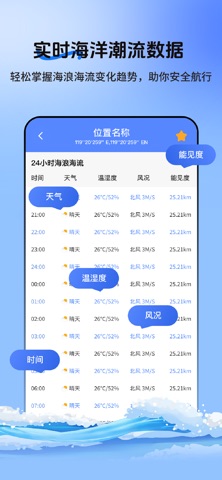
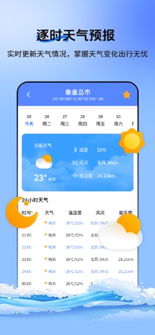
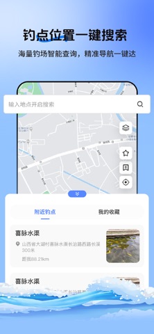
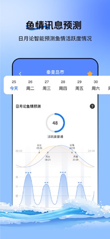
不管你是休闲赶海、专业海钓,还是冲浪、航海出行,精准的潮汐与海洋气象信息,都是安心出行的关键——潮汐实时预报,以实用功能、精准数据,适配每一种海边场景,帮你避开无效出行,高效规划行程。 核心今日潮汐功能,实时同步当前潮高、潮汐涨落时间,同步展示当日天气、风况(风速、风向),数据清晰直观,更新及时。不管是赶海想找准低潮时机,还是冲浪、游泳避开危险时段,或是航海、船舶出行参考潮汐与风况,都能快速获取所需信息,为出行安全保驾护航。 内置鱼情查询功能,结合潮汐规律、气象条件智能分析鱼情,为钓鱼、海钓爱好者提供垂钓参考,清晰标注适宜垂钓的时段与相关建议,助力避开空钓尴尬,合理安排垂钓行程,提升海边垂钓体验。 搭载实用钓点地图,直观呈现附近热门钓点、野钓点位置,支持切换地图模式,点击钓点可查看基础详情,方便海钓、钓鱼爱好者快速找到合适钓点,省去四处寻找的麻烦,让垂钓出行更省心。 全面适配多类海边使用场景:钓鱼、赶海、海钓、冲浪、航海、船舶航行、海边游泳等,无论是日常休闲娱乐,还是专业海上作业,都能依…
App details
What you can learn from 潮汐实时预报 - 精准潮汐查询, 赶海钓鱼助手与出海天气指南
Every shipping app on the App Store has gone through the same decisions you're working through right now: which screenshot goes first, what caption sits over it, which device frame to show, what color the background should be. The 5 screenshots above are 潮汐实时预报 - 精准潮汐查询, 赶海钓鱼助手与出海天气指南's answers to those questions — they're public, they're real, and they made it through Apple's review.
What the numbers say: 潮汐实时预报 - 精准潮汐查询, 赶海钓鱼助手与出海天气指南 runs a light set with one background colour (#94C4FC) carried across every screenshot — the listing reads as a single poster when the shots sit side by side in search results. The accent colour we picked up, #5484FC, is the one to reuse for badges, arrows and highlighted words if you borrow this look. Hit Use this style to open the editor with these exact colours and drop your own screenshot in.
Notice the first screenshot in particular. It's the one users see in search results and on the product page, and it's where most apps spend their best caption and tightest design. Look at the proportion of background to phone, where the text sits, what one thing the image is trying to communicate.
Want to see how other Weather apps approach the same problem? Browse more Weather apps in the showcase.
Take what works into your own screenshots
Open LaunchShots and design your App Store & Google Play screenshots — pick a device frame, drop captions, ship in minutes. Free, in your browser.
Open the screenshot editor →Apps with a similar look
Closest background + accent colours among the listings we've analysed — useful when you want to see the same palette handled by a different team.