Chart position — tracked daily by LaunchShots
Screenshot changes — detected by LaunchShots
Screenshot style breakdown
Sampled from 6 of maxim ru: заказ такси доставка's App Store screenshots — background, accent and theme, measured by LaunchShots (not something Apple publishes).
#FCDC04 bg
#DDC103
#645C24 accent
#111111 text
Screenshots


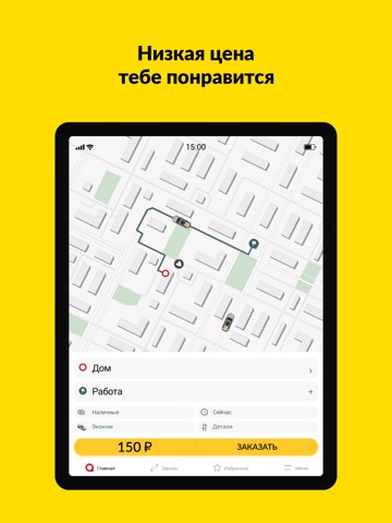
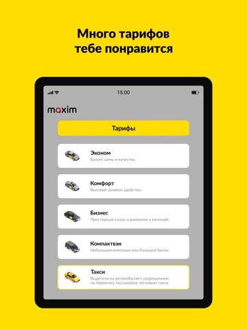
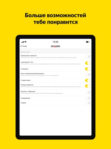
iPad screenshots





Icon palette
About this app
«Максим» — это удобные поездки с частными водителями, доставка, грузоперевозки. Ежедневно помогаем миллионам людей экономить деньги на такси, поездках и в путешествиях. Просто выберите подходящий тариф или услугу. «Эконом», «Срочный», «Комфорт» — на каждый день. «Эконом» часто выбирают для поездок по межгороду — это отличная возможность доехать с комфортом, но дешевле, чем «Такси». «Такси» — современный заказ традиционного такси. «Минивэн» и «Автобус» для путешествий большой компанией. «Грузовые» и «Грузчик» для перевозки вещей на любое расстояние и легкого переезда. Еще с погрузкой может помочь водитель. «Курьер» и «Купим и привезем», чтобы экономить время, отправлять и получать посылки, товары, еду или лекарства в комфортное время в удобном месте — дома, на работе или в гостях. Посмотрите полный список в приложении и оцените все возможности. Пожелания к заказу Дополнительно можн…
App details
What you can learn from maxim ru: заказ такси доставка
Every shipping app on the App Store has gone through the same decisions you're working through right now: which screenshot goes first, what caption sits over it, which device frame to show, what color the background should be. The 16 screenshots above are maxim ru: заказ такси доставка's answers to those questions — they're public, they're real, and they made it through Apple's review.
What the numbers say: maxim ru: заказ такси доставка runs a light set with one background colour (#FCDC04) carried across every screenshot — the listing reads as a single poster when the shots sit side by side in search results. The accent colour we picked up, #645C24, is the one to reuse for badges, arrows and highlighted words if you borrow this look. Hit Use this style to open the editor with these exact colours and drop your own screenshot in.
Notice the first screenshot in particular. It's the one users see in search results and on the product page, and it's where most apps spend their best caption and tightest design. Look at the proportion of background to phone, where the text sits, what one thing the image is trying to communicate.
Want to see how other Travel apps approach the same problem? Browse more Travel apps in the showcase.
Take what works into your own screenshots
Open LaunchShots and design your App Store & Google Play screenshots — pick a device frame, drop captions, ship in minutes. Free, in your browser.
Open the screenshot editor →Apps with a similar look
Closest background + accent colours among the listings we've analysed — useful when you want to see the same palette handled by a different team.