Chart position — tracked daily by LaunchShots
Screenshot style breakdown
Sampled from 4 of 札幌健康アプリ アルカサル's App Store screenshots — background, accent and theme, measured by LaunchShots (not something Apple publishes).
#FCFCFC bg
#DDDDDD
#046C34 accent
#111111 text
Screenshots


Icon palette
About this app
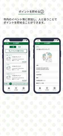
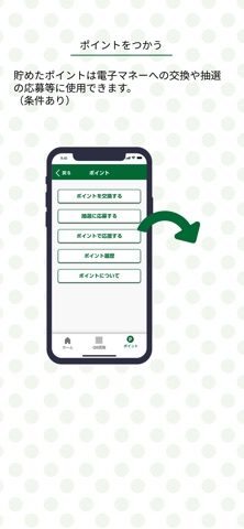
札幌市が提供する「札幌健康アプリ-アルカサル-」 札幌市にお住まいの高齢者の健康づくりを支えます! (40歳以上の方もご利用いただけます) ◆札幌健康アプリでできること◆ 【日々の健康づくりを支える】 歩数や体重、血圧を記録・見える化して、健康づくりの習慣化に役立ちます。 健康につながる自分なりの目標を立てて、達成状況を記録することができます。 自分の興味や好みにあったイベントを検索できます。 友人や家族等と一緒に、楽しくランキングで競うことができます。 【ポイントが貯まる】 歩く、健康管理、人と会う(イベント参加)など、自分に合った、気軽な活動に取り組むことで、ポイントが貯まります。 【貯めたポイントを交換】 貯めたポイントは、電子マネーへの交換(※)や、抽選への応募などにご利用いただけます。 ※電子マネーに交換できるのは、65歳以上の札幌市民で一定の条件を満たした方に限ります。 【詳しくはこちら(https://healthapp.city.sapporo.jp/)】
App details
What you can learn from 札幌健康アプリ アルカサル
Every shipping app on the App Store has gone through the same decisions you're working through right now: which screenshot goes first, what caption sits over it, which device frame to show, what color the background should be. The 4 screenshots above are 札幌健康アプリ アルカサル's answers to those questions — they're public, they're real, and they made it through Apple's review.
What the numbers say: 札幌健康アプリ アルカサル runs a light set with one background colour (#FCFCFC) carried across every screenshot — the listing reads as a single poster when the shots sit side by side in search results. The accent colour we picked up, #046C34, is the one to reuse for badges, arrows and highlighted words if you borrow this look. Hit Use this style to open the editor with these exact colours and drop your own screenshot in.
Notice the first screenshot in particular. It's the one users see in search results and on the product page, and it's where most apps spend their best caption and tightest design. Look at the proportion of background to phone, where the text sits, what one thing the image is trying to communicate.
Want to see how other Health & Fitness apps approach the same problem? Browse more Health & Fitness apps in the showcase.
Take what works into your own screenshots
Open LaunchShots and design your App Store & Google Play screenshots — pick a device frame, drop captions, ship in minutes. Free, in your browser.
Open the screenshot editor →Apps with a similar look
Closest background + accent colours among the listings we've analysed — useful when you want to see the same palette handled by a different team.