Chart position — tracked daily by LaunchShots
Screenshot style breakdown
Sampled from 3 of シンプル気圧計's App Store screenshots — background, accent and theme, measured by LaunchShots (not something Apple publishes).
#ECECDC bg
#CFCFC1
#B43454 accent
#111111 text
Reading the caption text from the screenshots in your browser…
Screenshots

Icon palette
About this app
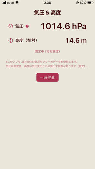
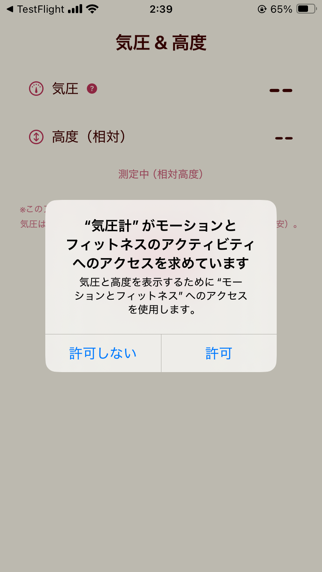
シンプル気圧計は iPhone の気圧センサーから得たデータを読み取り、現在の 気圧(hPa) と 高度 をシンプルに表示するアプリです。ホーム画面のウィジェットでも、最終更新時刻とともに最新の値を確認できます。 主な機能 ・気圧(hPa)を見やすい等幅数字で表示 ・対応機では 絶対高度(海抜)、非対応機では 相対高度 を表示 ・ホーム画面ウィジェットに最新値を表示(「最終更新」付き) ・iPhoneの「モーションとフィットネス」権限を使用 ご注意 ・ウィジェットはセンサーに直接アクセスしないため、アプリ前面で取得した最新値を表示します。 ・バックグラウンドの常時計測や“数分ごとの厳密な自動更新”は行いません(WidgetKitの仕様に準拠)。 ・高度は気圧からの推定を含むため目安です。環境・気象条件により誤差があります。 ・医学的な診断や治療を目的とした医療機器ではありません。 動作環境 ・iPhone/iOS 18.0 以降 プライバシー ・外部サーバーとの通信やデータ収集は行いません。 注約(用語の説明) ・hPa(ヘクトパスカル):気圧の単位。…
App details
What you can learn from シンプル気圧計
Every shipping app on the App Store has gone through the same decisions you're working through right now: which screenshot goes first, what caption sits over it, which device frame to show, what color the background should be. The 3 screenshots above are シンプル気圧計's answers to those questions — they're public, they're real, and they made it through Apple's review.
What the numbers say: シンプル気圧計 runs a light set where the background shifts from screenshot to screenshot (first shot #ECECDC) — each image has to stand on its own, so the captions carry more of the story. The accent colour we picked up, #B43454, is the one to reuse for badges, arrows and highlighted words if you borrow this look. Hit Use this style to open the editor with these exact colours and drop your own screenshot in.
Notice the first screenshot in particular. It's the one users see in search results and on the product page, and it's where most apps spend their best caption and tightest design. Look at the proportion of background to phone, where the text sits, what one thing the image is trying to communicate.
Want to see how other Weather apps approach the same problem? Browse more Weather apps in the showcase.
Take what works into your own screenshots
Open LaunchShots and design your App Store & Google Play screenshots — pick a device frame, drop captions, ship in minutes. Free, in your browser.
Open the screenshot editor →Apps with a similar look
Closest background + accent colours among the listings we've analysed — useful when you want to see the same palette handled by a different team.