Chart position — tracked daily by LaunchShots
Screenshot style breakdown
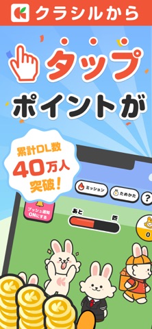
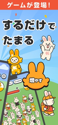
Sampled from 6 of 増えうさぎ by クラシル's App Store screenshots — background, accent and theme, measured by LaunchShots (not something Apple publishes).
#8CC46C bg
#7BAC5F
#84C4FC accent
#111111 text
Screenshots


Icon palette
About this app
【増えうさぎとは?】 大人気「クラシル」シリーズから、タップだけでどんどん増える『増えうさぎ』が新登場! かわいいうさぎたちが無限に増えていく様子を眺めながら、効率よくポイントを集められるシンプル&放置系ゲームです。 短い時間でもガッツリ稼げる! スキマ時間にタップするだけで、リワードを効率よく貯められるのが最大の魅力です。 【増えうさぎってなに?】 操作はとてもシンプル。 画面をタップすると、かわいいうさぎが次々に増えていきます。 さらに、増えたうさぎの中には"特別な「ゴールドうさぎ」"が出現することも! ゴールドうさぎを集めてレベルアップしていくと、新しいうさぎや機能が解放され、効率がどんどんアップします。 1. 画面をタップしてうさぎを増やす 2. たまに出るゴールドうさぎを集める 3. レベルアップで新しいうさぎや機能を解放 4. 放置でも自動でうさぎが増えてポイントゲット! 【遊び方】 1. タップしてうさぎを増やそう 2. ゴールドうさぎを集めて効率アップ 3. レベルアップで新しいうさぎを解放 4. 放置し…
App details
What you can learn from 増えうさぎ by クラシル
Every shipping app on the App Store has gone through the same decisions you're working through right now: which screenshot goes first, what caption sits over it, which device frame to show, what color the background should be. The 6 screenshots above are 増えうさぎ by クラシル's answers to those questions — they're public, they're real, and they made it through Apple's review.
What the numbers say: 増えうさぎ by クラシル runs a light set with one background colour (#8CC46C) carried across every screenshot — the listing reads as a single poster when the shots sit side by side in search results. The accent colour we picked up, #84C4FC, is the one to reuse for badges, arrows and highlighted words if you borrow this look. Hit Use this style to open the editor with these exact colours and drop your own screenshot in.
Notice the first screenshot in particular. It's the one users see in search results and on the product page, and it's where most apps spend their best caption and tightest design. Look at the proportion of background to phone, where the text sits, what one thing the image is trying to communicate.
Want to see how other Games apps approach the same problem? Browse more Games apps in the showcase.
Take what works into your own screenshots
Open LaunchShots and design your App Store & Google Play screenshots — pick a device frame, drop captions, ship in minutes. Free, in your browser.
Open the screenshot editor →Apps with a similar look
Closest background + accent colours among the listings we've analysed — useful when you want to see the same palette handled by a different team.