Chart position — tracked daily by LaunchShots
Screenshot style breakdown
Sampled from 6 of 恋刻-快速匹配附近的人's App Store screenshots — background, accent and theme, measured by LaunchShots (not something Apple publishes).
#FCFCFC bg
#DDDDDD
#FCF444 accent
#111111 text
Screenshots




Icon palette
About this app
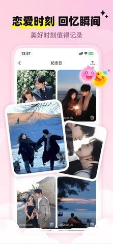
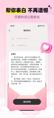
《恋刻》:珍藏每一次心动,陪伴相爱的每一程 在快节奏的现代生活中,那些关于爱的细微瞬间是否总是悄然溜走?《恋刻》——专为珍视爱情的你们设计,是一款致力于记录、升温与守护每一段亲密关系的全周期情感伴侣APP。 这里是你专属的“爱情记忆博物馆”。随手上传你们的美好合影,用智能相册分类珍藏,让每一次旅行、纪念日或日常嬉笑,都清晰归档,随时重温时光里的温柔与甜蜜。 对于初识的忐忑与羞涩,我们的 【快速破冰】 功能,通过有趣的话题和轻松的互动游戏,巧妙融化尴尬,让真诚的对话自然流淌,助你与心仪对象快速走进彼此的世界。 而当你心中藏着一份未说出口的喜欢,《恋刻》愿做你最信赖的“告白信使”。我们提供贴心又富有创意的表白方案,守护你最初的那份悸动与真诚,帮你勇敢迈出关键一步,将心意温柔传递。 从初遇的心动、热恋的浓情到长久的陪伴,《恋刻》提供的不只是工具,更是一份贯穿恋爱全周期的温暖解决方案。我们相信,爱需要被记录,更需要被智慧地经营。 下载《恋刻》,开启属于你们的爱情时光。让每一次心动,都有回响;让相爱的旅程,…
App details
What you can learn from 恋刻-快速匹配附近的人
Every shipping app on the App Store has gone through the same decisions you're working through right now: which screenshot goes first, what caption sits over it, which device frame to show, what color the background should be. The 6 screenshots above are 恋刻-快速匹配附近的人's answers to those questions — they're public, they're real, and they made it through Apple's review.
What the numbers say: 恋刻-快速匹配附近的人 runs a light set with one background colour (#FCFCFC) carried across every screenshot — the listing reads as a single poster when the shots sit side by side in search results. The accent colour we picked up, #FCF444, is the one to reuse for badges, arrows and highlighted words if you borrow this look. Hit Use this style to open the editor with these exact colours and drop your own screenshot in.
Notice the first screenshot in particular. It's the one users see in search results and on the product page, and it's where most apps spend their best caption and tightest design. Look at the proportion of background to phone, where the text sits, what one thing the image is trying to communicate.
Want to see how other Reference apps approach the same problem? Browse more Reference apps in the showcase.
Take what works into your own screenshots
Open LaunchShots and design your App Store & Google Play screenshots — pick a device frame, drop captions, ship in minutes. Free, in your browser.
Open the screenshot editor →Apps with a similar look
Closest background + accent colours among the listings we've analysed — useful when you want to see the same palette handled by a different team.