Screenshot style breakdown
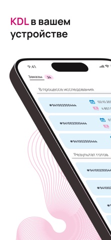
Sampled from 6 of KDL Мобильные сервисы's App Store screenshots — background, accent and theme, measured by LaunchShots (not something Apple publishes).
#FCFCFC bg
#DDDDDD
#B40C5C accent
#111111 text
Screenshots


Icon palette
About this app
KDL Мобильные сервисы Ваш персональный медицинский помощник, являющийся частью комплексной информационной системы «KDL». Предоставляет пациентам удобный и безопасный инструмент для управления своими лабораторными исследованиями, экономя время и обеспечивая полный контроль над медицинскими данными. Ключевые возможности приложения: - Безопасный доступ к личному кабинету Ваши данные под надёжной защитой. Мы используем многофакторную аутентификацию для входа и обеспечиваем защищённое соединение. - Централизованное управление результатами Больше не нужно хранить бумажные бланки или искать результаты в разных местах. В приложении вы можете: 1. Просматривать все свои лабораторные анализы в одном разделе; 2. Экспортировать результаты удобном формате PDF для передачи лечащему врачу; 3. Встроенная служба поддержки Возникли вопросы? Не нужно звонить или писать на почту. Прямо в приложении вы…
App details
What you can learn from KDL Мобильные сервисы
Every shipping app on the App Store has gone through the same decisions you're working through right now: which screenshot goes first, what caption sits over it, which device frame to show, what color the background should be. The 6 screenshots above are KDL Мобильные сервисы's answers to those questions — they're public, they're real, and they made it through Apple's review.
What the numbers say: KDL Мобильные сервисы runs a mixed light-and-dark set where the background shifts from screenshot to screenshot (first shot #FCFCFC) — each image has to stand on its own, so the captions carry more of the story. The accent colour we picked up, #B40C5C, is the one to reuse for badges, arrows and highlighted words if you borrow this look. Hit Use this style to open the editor with these exact colours and drop your own screenshot in.
Notice the first screenshot in particular. It's the one users see in search results and on the product page, and it's where most apps spend their best caption and tightest design. Look at the proportion of background to phone, where the text sits, what one thing the image is trying to communicate.
Want to see how other Health & Fitness apps approach the same problem? Browse more Health & Fitness apps in the showcase.
Take what works into your own screenshots
Open LaunchShots and design your App Store & Google Play screenshots — pick a device frame, drop captions, ship in minutes. Free, in your browser.
Open the screenshot editor →Apps with a similar look
Closest background + accent colours among the listings we've analysed — useful when you want to see the same palette handled by a different team.