Chart position — tracked daily by LaunchShots
Screenshot changes — detected by LaunchShots
Screenshot style breakdown
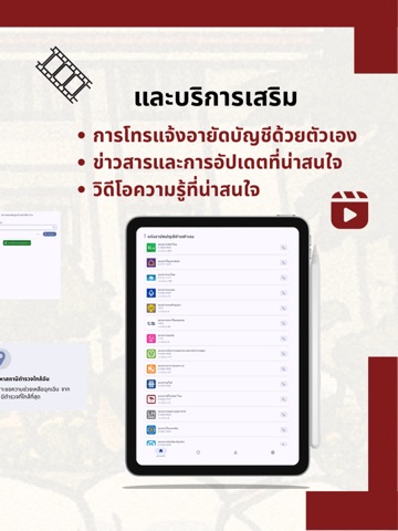
Sampled from 5 of Police Care's App Store screenshots — background, accent and theme, measured by LaunchShots (not something Apple publishes).
#841C1C bg
#953B3B
#DC0C0C accent
#FFFFFF text
Screenshots


iPad screenshots


Icon palette
About this app
Police Care คือแอปช่วยให้ประชาชนเข้าถึงข้อมูลและบริการที่เกี่ยวกับตำรวจได้ง่ายและรวดเร็ว ทั้งการค้นหาสถานีใกล้ฉัน ตรวจสอบข้อมูลที่ติดต่อ ตลอดจนอ่านข่าวและคู่มือการดำเนินเรื่องสำคัญในชีวิตประจำวันอย่างเป็นขั้นตอน คุณสมบัติหลัก • ค้นหาสถานีใกล้ฉัน และในพื้นที่รับผิดชอบ พร้อมนำทางและโทรติดต่อได้ทันที • ตรวจสอบข้อมูลสถานีตำรวจ: ชื่อหน่วยงาน ที่ตั้ง หมายเลขโทรศัพท์ และข้อมูลที่เกี่ยวข้อง • ตรวจสอบข้อมูลเจ้าหน้าที่ที่เปิดเผยต่อสาธารณะ เพื่อความโปร่งใสและการติดต่อที่ถูกต้อง • ข่าวและอัปเดตที่เกี่ยวข้องกับความปลอดภัยสาธารณะ • คู่มือสำหรับประชาชน: สรุปขั้นตอน เอกสาร ค่าธรรมเนียม หน่วยงานผู้รับผิดชอบ และช่องทางติดต่อ • วิดีโอ/คอนเทนต์ความปลอดภัย เพื่อการเรียนรู้ที่เข้าถึงง่าย • การเข้าถึง (Accessibility): รองรับตัวอักษรใหญ่ คอนทราสต์สูง และการอ่านหน้าจอ • ทำงานออฟไลน์บางส่วน ด้วยการแคชข้อมูลล่าสุด เพื่อใช้งานได้แม้สัญญาณไม่เสถียร ความเป็นส่วนตัวและสิทธิ์การใช้งาน แอปอาจขอสิทธิ์ตำแหน่งเพื่อค้นหา…
App details
What you can learn from Police Care
Every shipping app on the App Store has gone through the same decisions you're working through right now: which screenshot goes first, what caption sits over it, which device frame to show, what color the background should be. The 10 screenshots above are Police Care's answers to those questions — they're public, they're real, and they made it through Apple's review.
What the numbers say: Police Care runs a mixed light-and-dark set where the background shifts from screenshot to screenshot (first shot #841C1C) — each image has to stand on its own, so the captions carry more of the story. The accent colour we picked up, #DC0C0C, is the one to reuse for badges, arrows and highlighted words if you borrow this look. Hit Use this style to open the editor with these exact colours and drop your own screenshot in.
Notice the first screenshot in particular. It's the one users see in search results and on the product page, and it's where most apps spend their best caption and tightest design. Look at the proportion of background to phone, where the text sits, what one thing the image is trying to communicate.
Want to see how other Utilities apps approach the same problem? Browse more Utilities apps in the showcase.
Take what works into your own screenshots
Open LaunchShots and design your App Store & Google Play screenshots — pick a device frame, drop captions, ship in minutes. Free, in your browser.
Open the screenshot editor →Apps with a similar look
Closest background + accent colours among the listings we've analysed — useful when you want to see the same palette handled by a different team.