Screenshot style breakdown
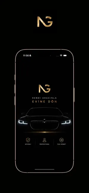
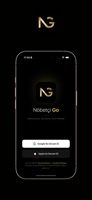
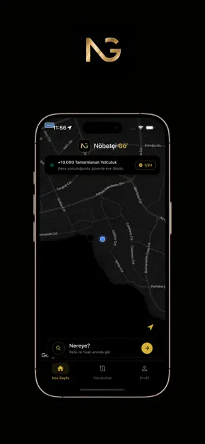
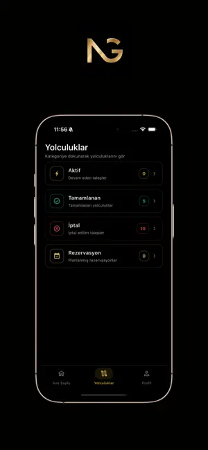
Sampled from 4 of Nöbetçi Go's App Store screenshots — background, accent and theme, measured by LaunchShots (not something Apple publishes).
#040404 bg
#272727
#C48C64 accent
#FFFFFF text
Reading the caption text from the screenshots in your browser…
Screenshots
Icon palette
About this app
Eğlenceli bir gecenin ardından arabanızı park yerinde bırakmak zorunda kalmayın! Nöbetçi Go, siz ve aracınız için güvenli bir eve dönüş sağlayan profesyonel bir şoför çağırma uygulamasıdır. İster bulunduğunuz anda bir şoföre ihtiyacınız olsun, ister ileriki bir tarih için planlama yapın; Nöbetçi Go ile yolculuğunuzun fiyatını, mesafesini ve tahmini süresini anında hesaplayabilirsiniz. NASIL ÇALIŞIR? Nereden alınacağınızı ve nereye gideceğinizi seçin. "Fiyat Hesapla" butonuna basarak gündüz veya gece tarifesine göre tahmini ücreti, mesafeyi ve süreyi anında görün. "Şoför Çağır" ile hemen bir talep oluşturun veya "Rezervasyon Yap" ile en az 3 saat sonrası için yolculuğunuzu planlayın. Talebiniz onaylandığında, atanan şoförünüzle güvenle yolculuk yapın. ÖZELLİKLER: • Hemen Şoför Çağırma: Acil ihtiyaçlarınız için en geç 45 dakika içinde şoförünüz adresinizde. • İleri Tarihli Rezervas…
App details
What you can learn from Nöbetçi Go
Every shipping app on the App Store has gone through the same decisions you're working through right now: which screenshot goes first, what caption sits over it, which device frame to show, what color the background should be. The 4 screenshots above are Nöbetçi Go's answers to those questions — they're public, they're real, and they made it through Apple's review.
What the numbers say: Nöbetçi Go runs a dark set with one background colour (#040404) carried across every screenshot — the listing reads as a single poster when the shots sit side by side in search results. The accent colour we picked up, #C48C64, is the one to reuse for badges, arrows and highlighted words if you borrow this look. Hit Use this style to open the editor with these exact colours and drop your own screenshot in.
Notice the first screenshot in particular. It's the one users see in search results and on the product page, and it's where most apps spend their best caption and tightest design. Look at the proportion of background to phone, where the text sits, what one thing the image is trying to communicate.
Want to see how other Travel apps approach the same problem? Browse more Travel apps in the showcase.
Take what works into your own screenshots
Open LaunchShots and design your App Store & Google Play screenshots — pick a device frame, drop captions, ship in minutes. Free, in your browser.
Open the screenshot editor →Apps with a similar look
Closest background + accent colours among the listings we've analysed — useful when you want to see the same palette handled by a different team.